AMANUALE
A STEP INTO PLEASURE

La Manual Alpargatera is a Spanish brand with centuries of tradition, known for crafting Espadrilles that combine comfort and style inspired by cultural heritage. 'Amanuale' is the rebrand and pop-up concept rooted in Mediterranean heritage. The narrative centers around a curated, exchangeable collection that encourages customers to 'Step in Pleasure.' Driven by the idea of constant transformation and connecting people to their ideal footwear, the brand's adaptability invites us to create a summer fantasy where every step is an adventure.



‘AMANUALE’
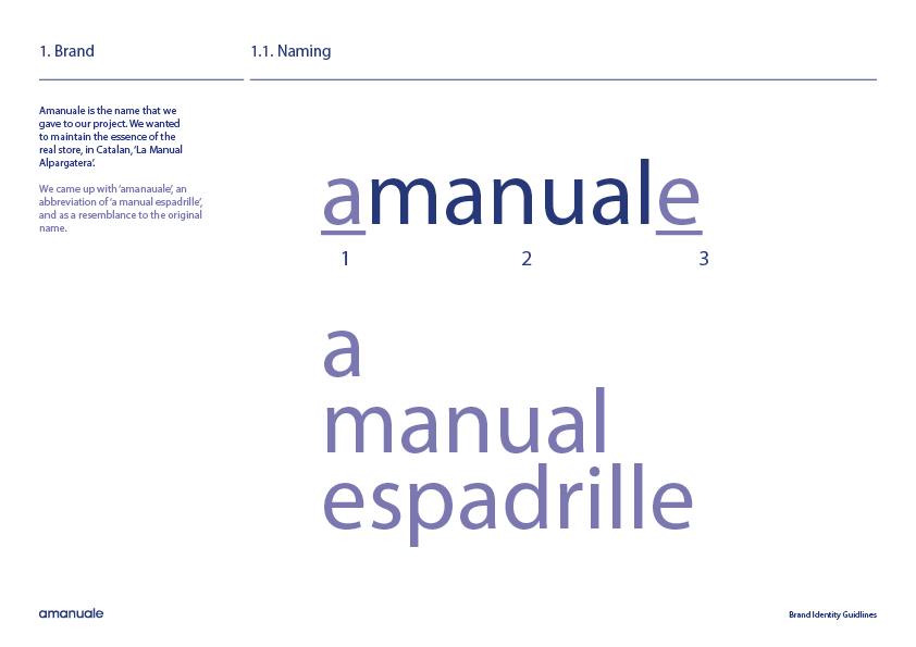
Amanuale is the name we chose for our project, inspired by the essence of the original store, 'La Manual Alpargatera' in Catalan. We coined 'Amanuale' as a shortened form of 'a manual espadrille,' keeping a clear connection to the brand’s heritage while giving it a modern, distinctive twist.
‘POP-UP STORE’
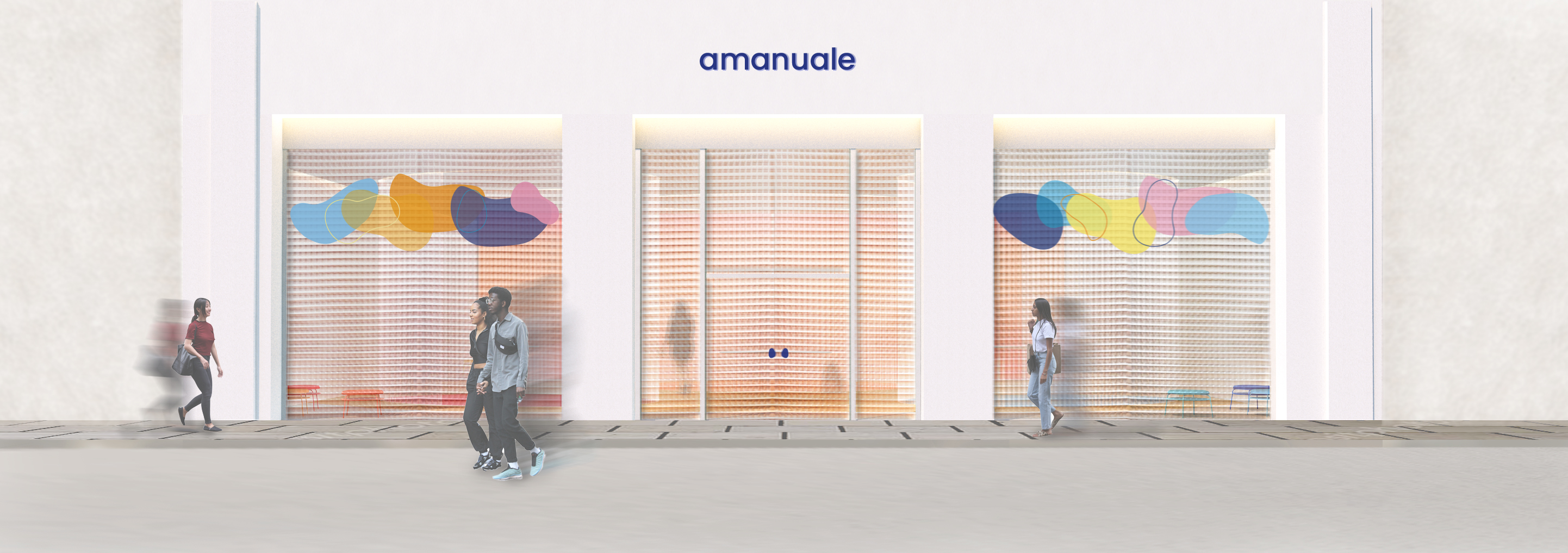
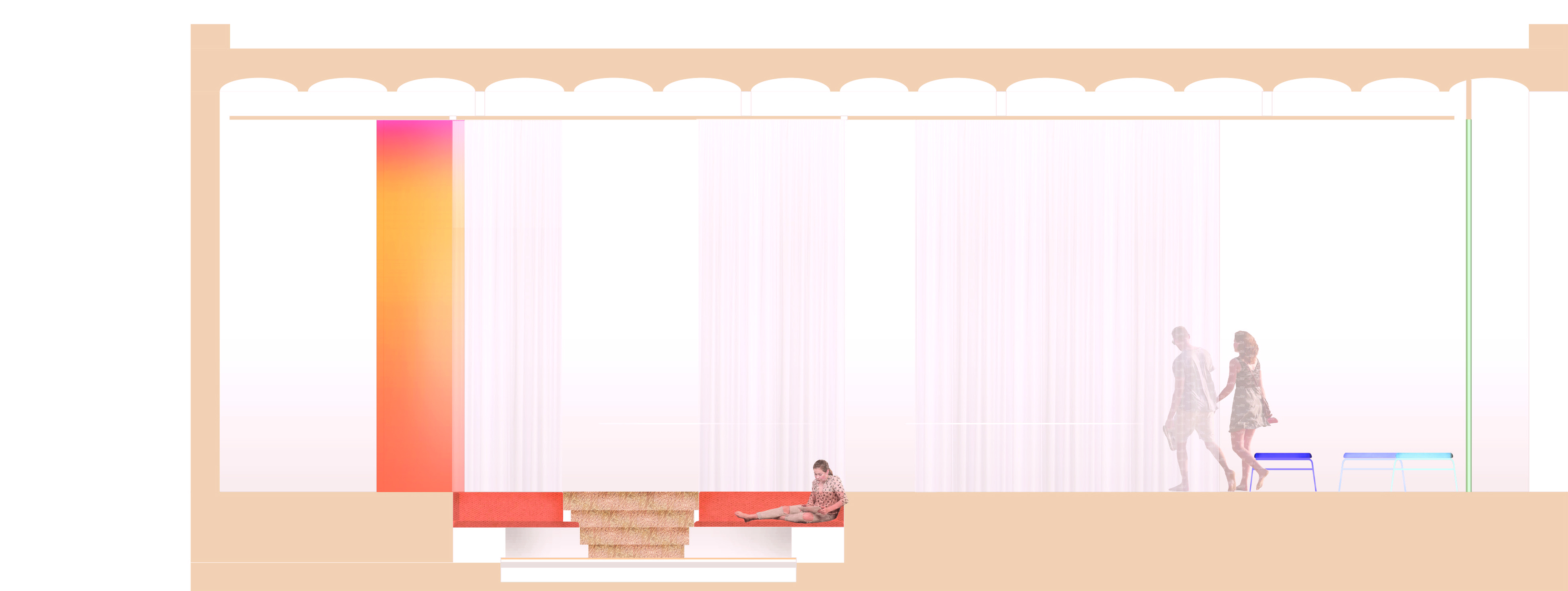
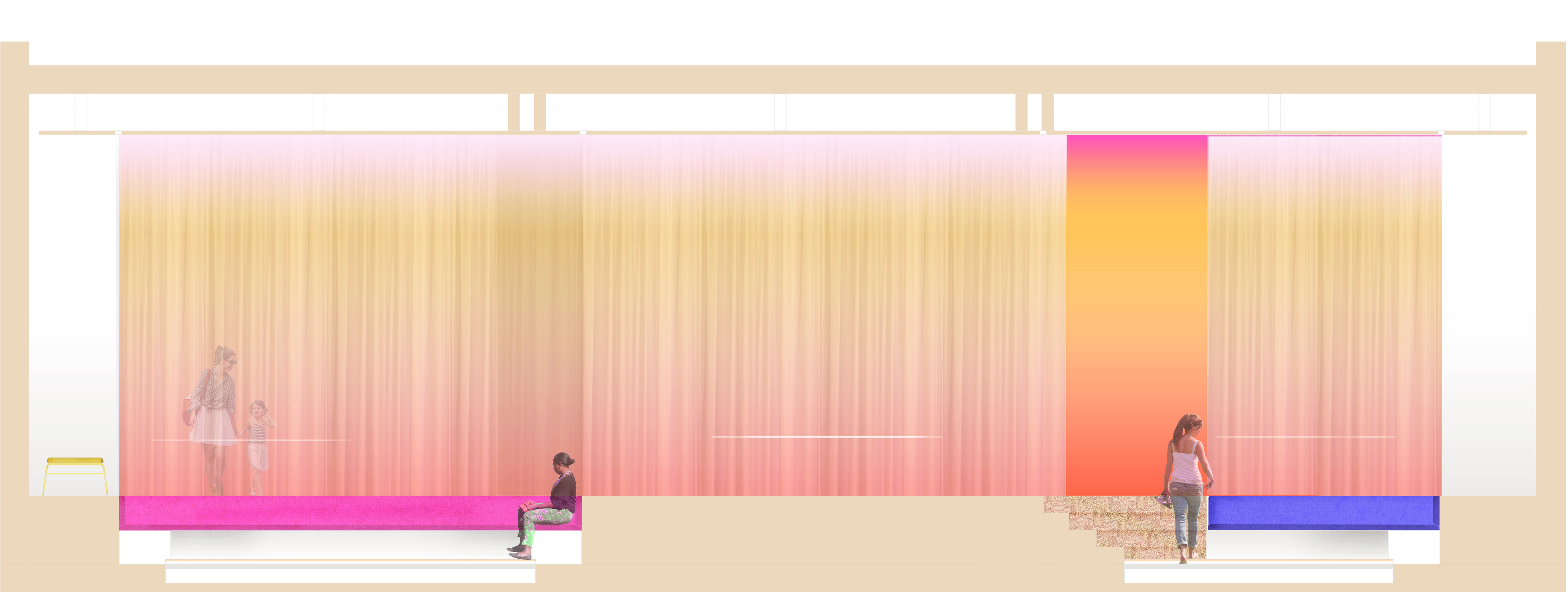
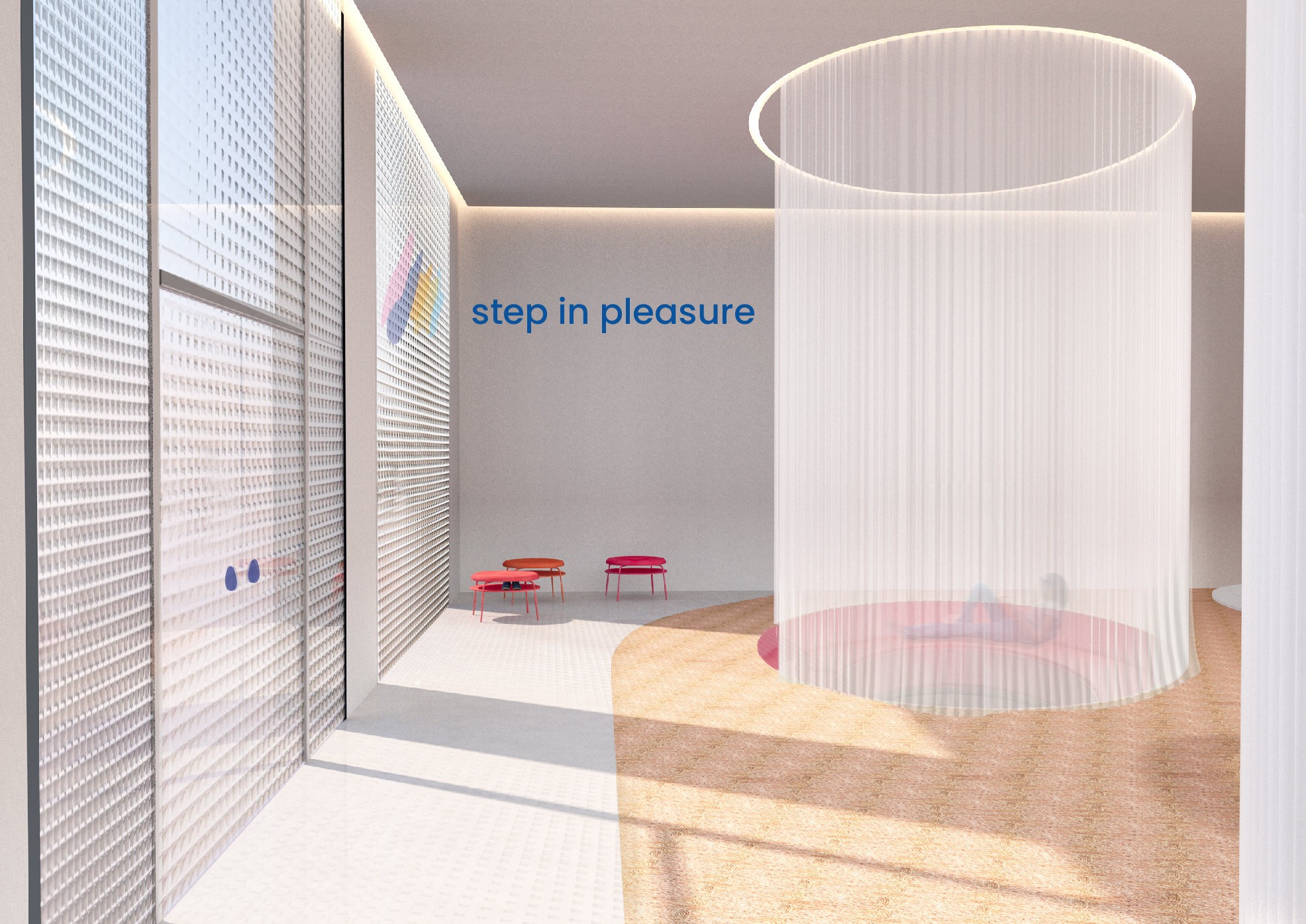
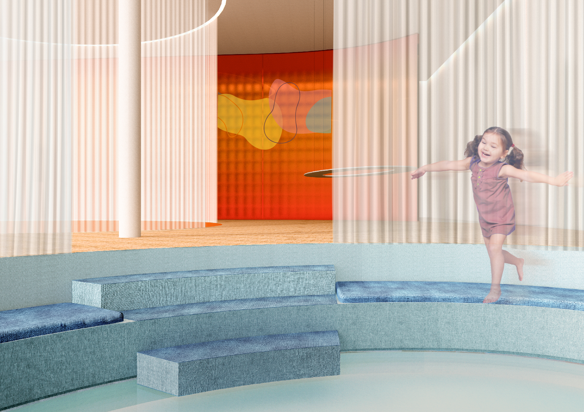
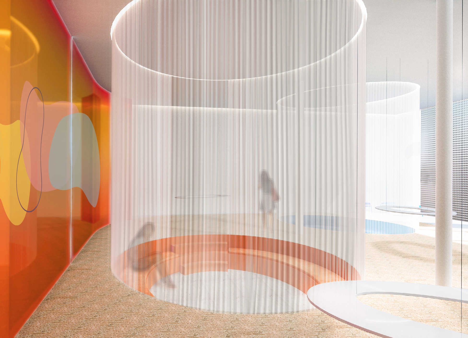
The Amanuale shop is located in the heart of Gracia, a vibrant and dynamic neighborhood in Barcelona, popular with both locals and tourists. It’s the perfect setting for our target audience—young, open-minded individuals aged 20 to 30, who are drawn to the area’s blend of laid-back charm and cutting-edge trends. The shop is divided into three main zones, each designed to reflect the concept of 'summer fantasy' and comfort. Upon entering, customers are invited to remove their shoes in the first zone, which features seating and storage with a shiny white floor that guides them to the next area.
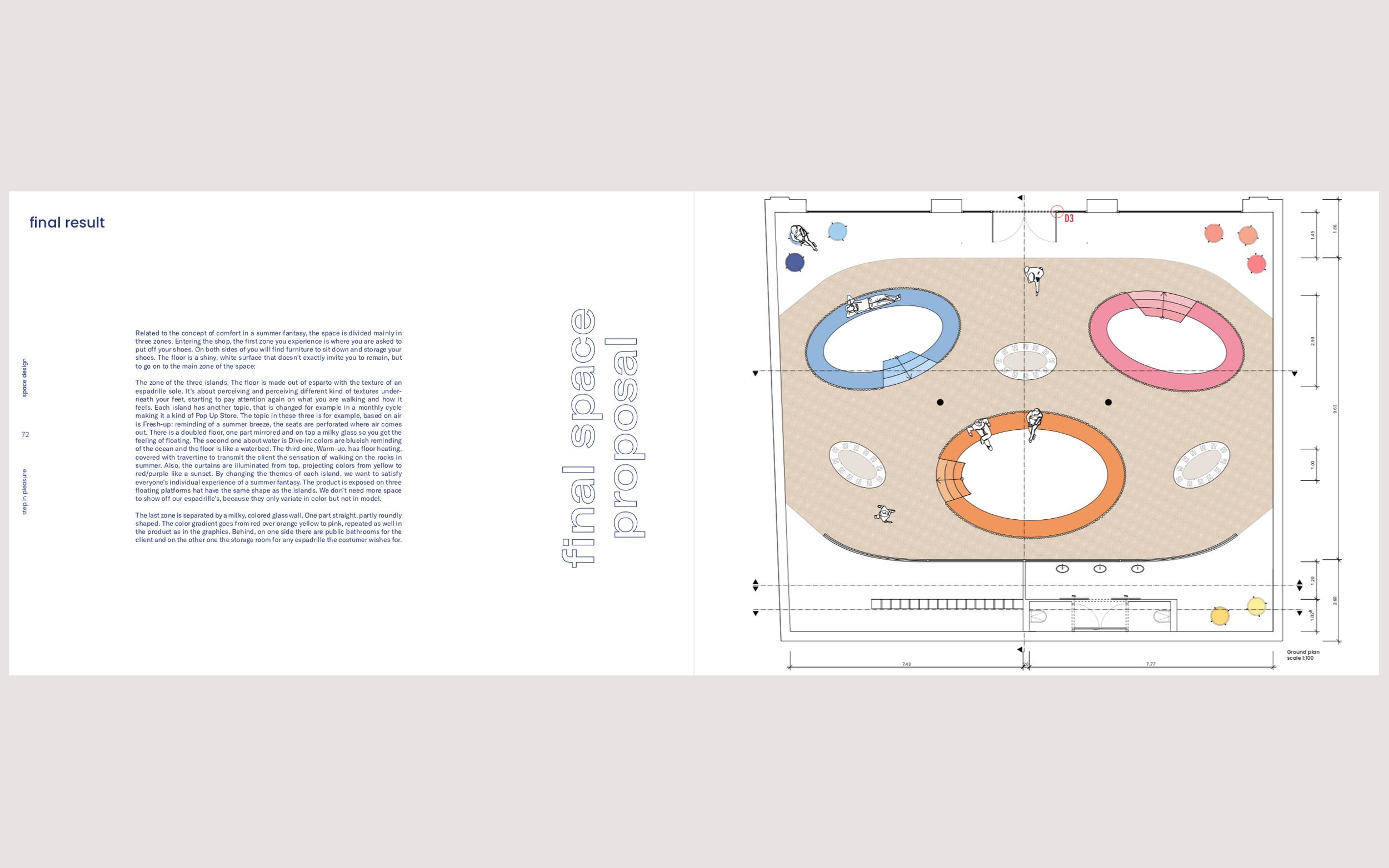
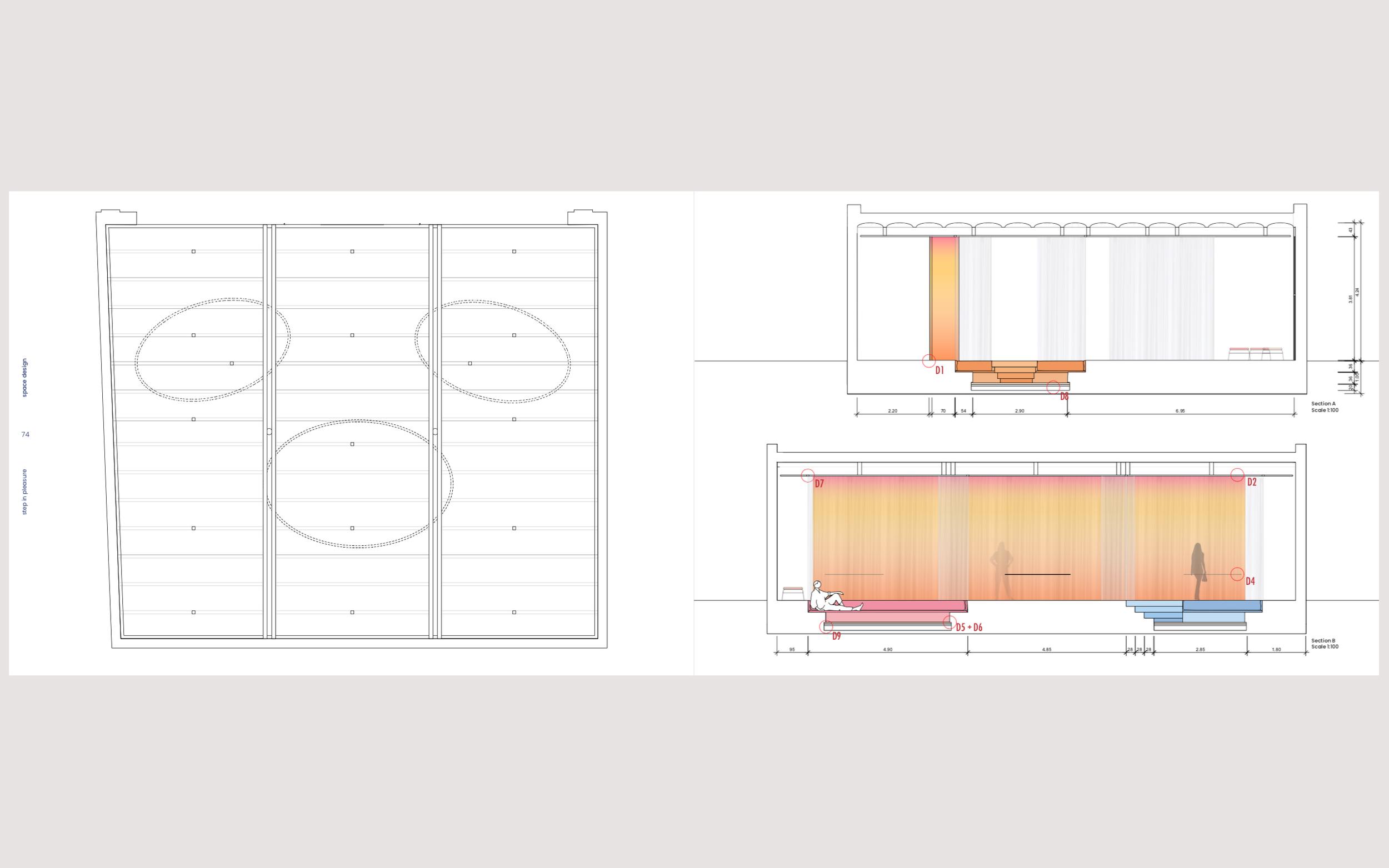
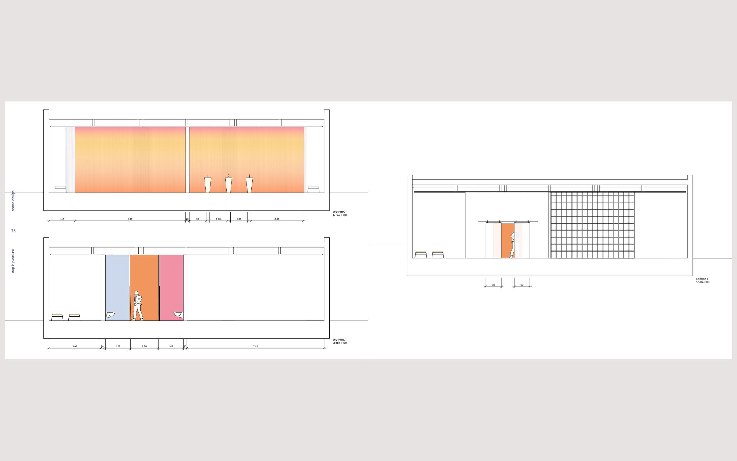
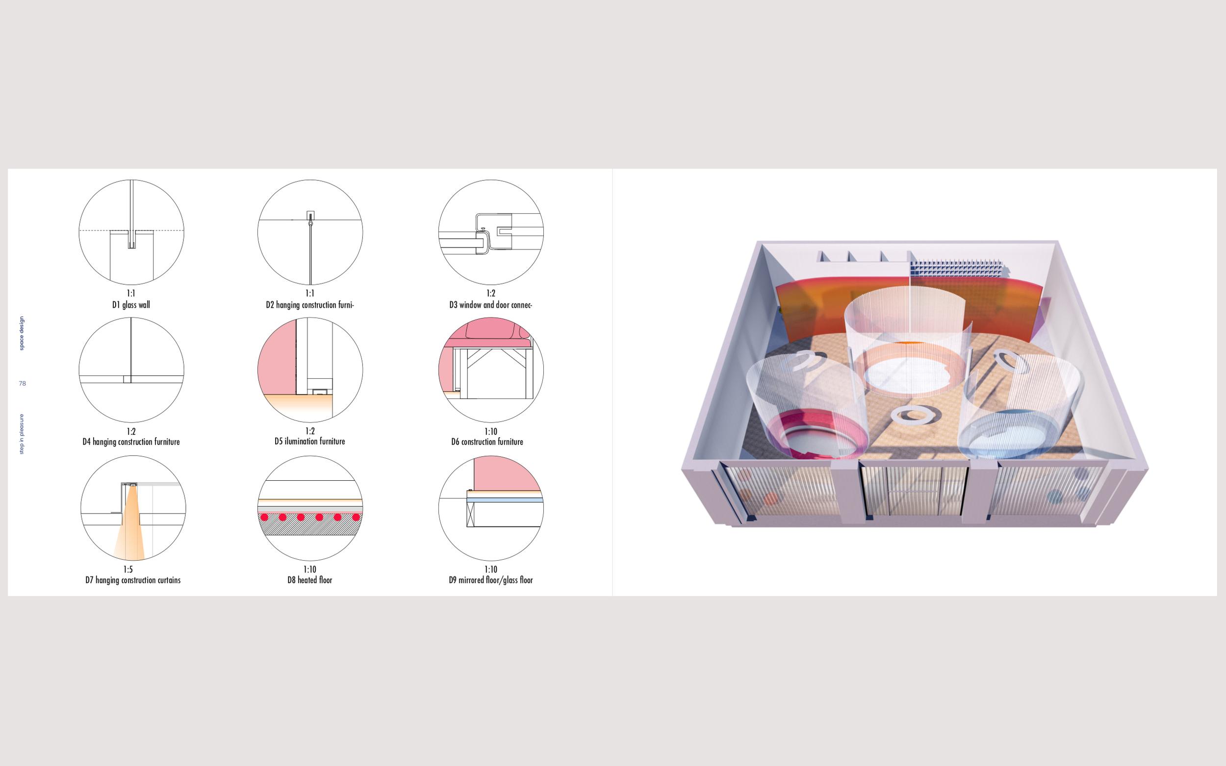
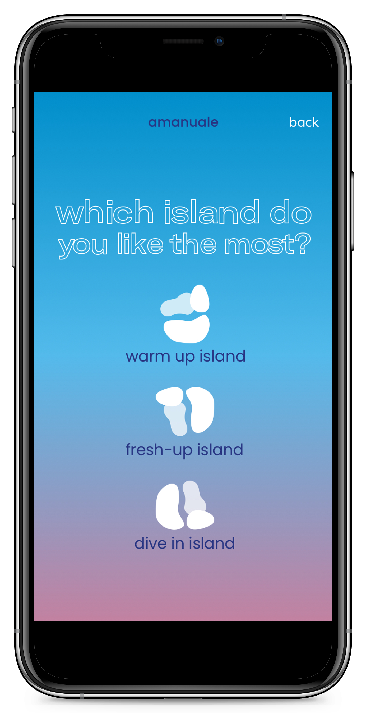
Entry Zone: Visitors remove their shoes, with seating and storage available. Three Islands Zone: Each island represents a theme—Fresh-up (air), Dive-in (water), and Warm-up (sun)—with sensory elements like cool air, waterbed-like floors, and heated surfaces to evoke the feeling of summer. Final Zone: Separated by a gradient-colored glass wall, this area includes restrooms and storage for additional espadrilles. Products are displayed on floating platforms, and the space changes monthly like a pop-up store, providing a unique, immersive shopping experience.

‘ESPADRILLE’
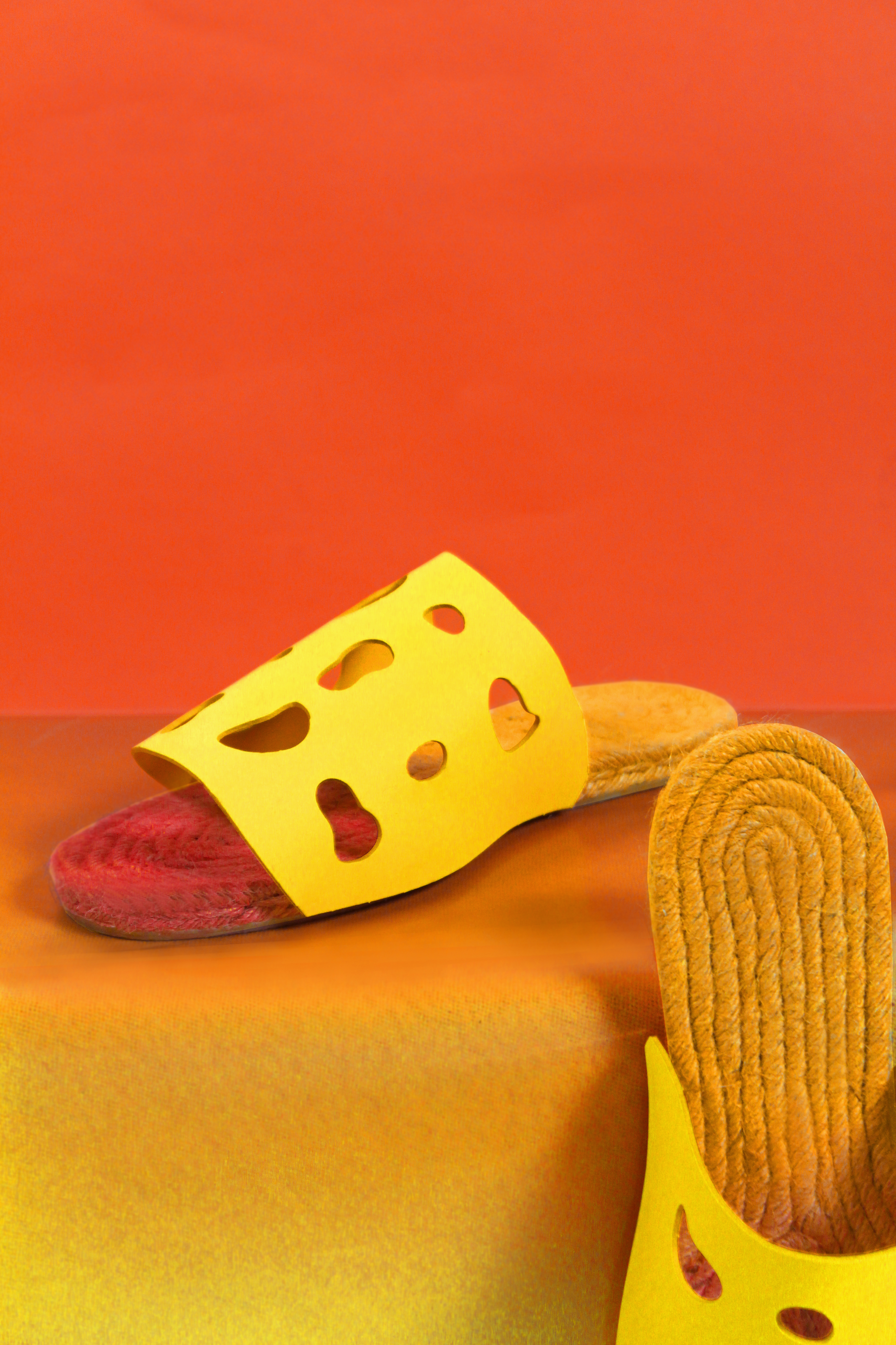
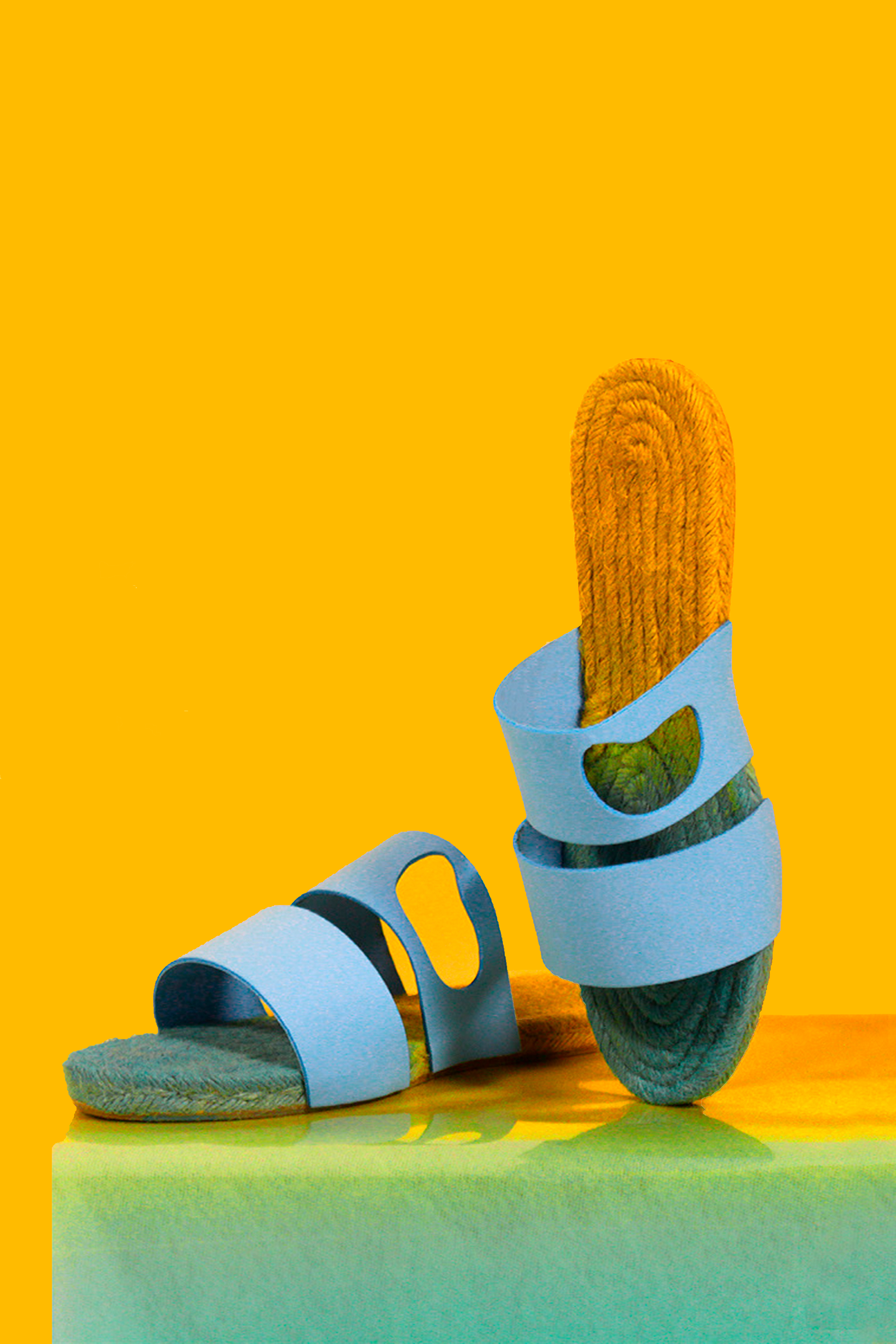
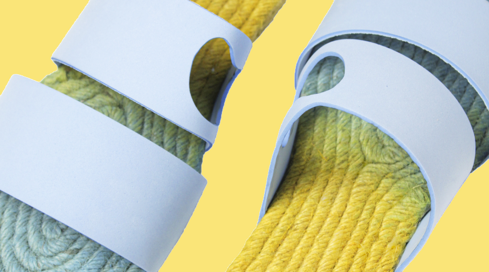
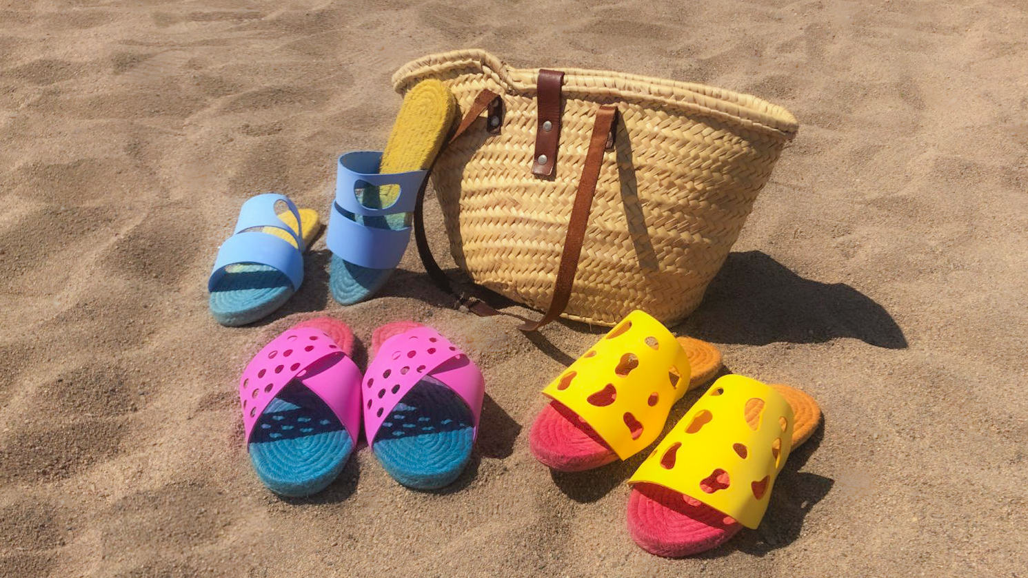
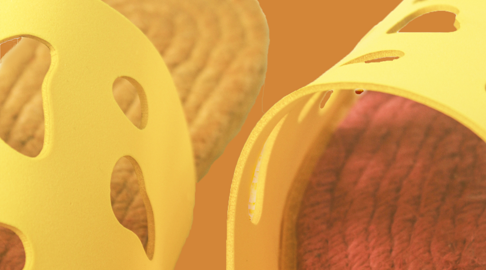
We retained esparto as the primary material for the espadrilles, while preserving the gradient color combinations from the brand’s identity. For a more personalized experience, customers can mix and match colors that reflect their unique journey and the pleasure they experience in the pop-up store, bringing their ideal summer fantasy to life. Amanuale's products are grounded in the brand's core values: comfort, adaptability, and a truly customized experience.


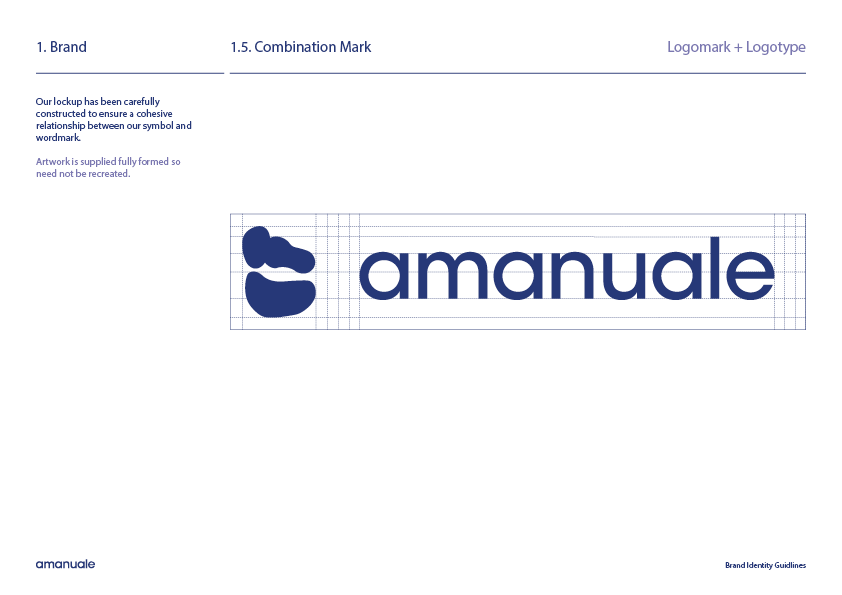


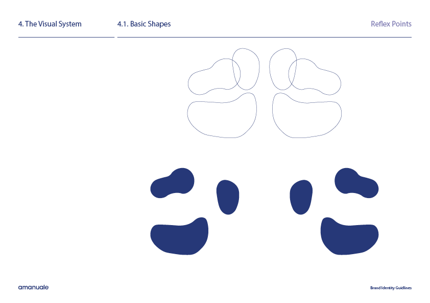

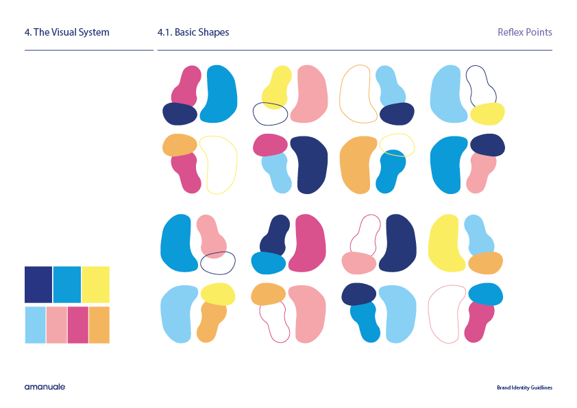
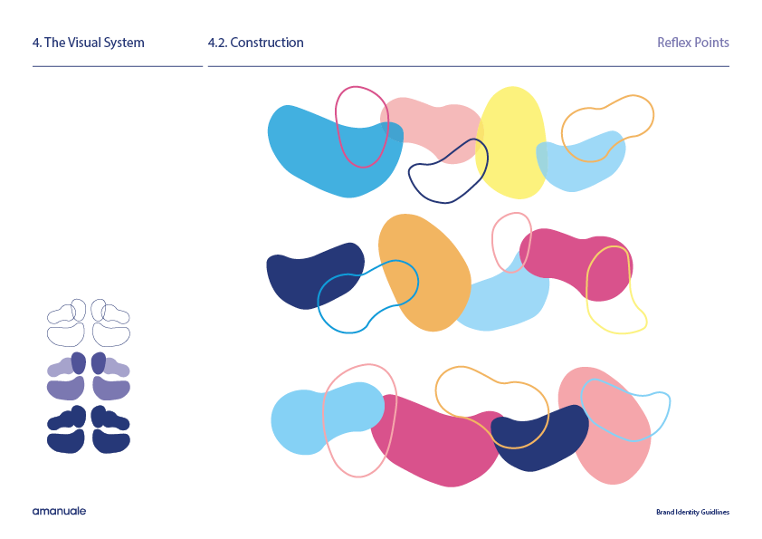

‘AMANUALE BRAND GUIDLINESS’
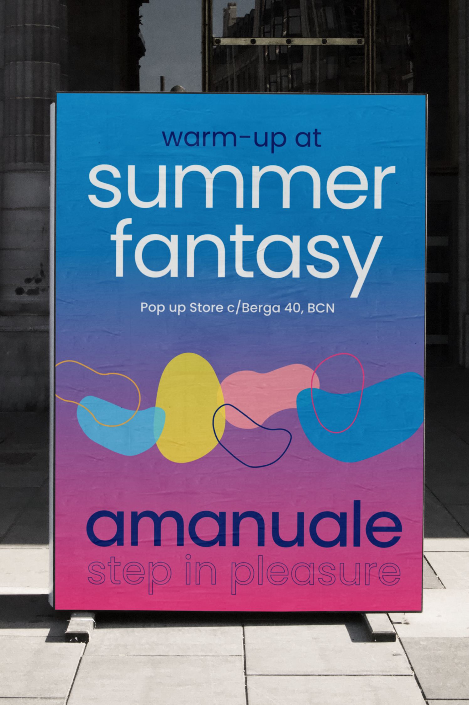
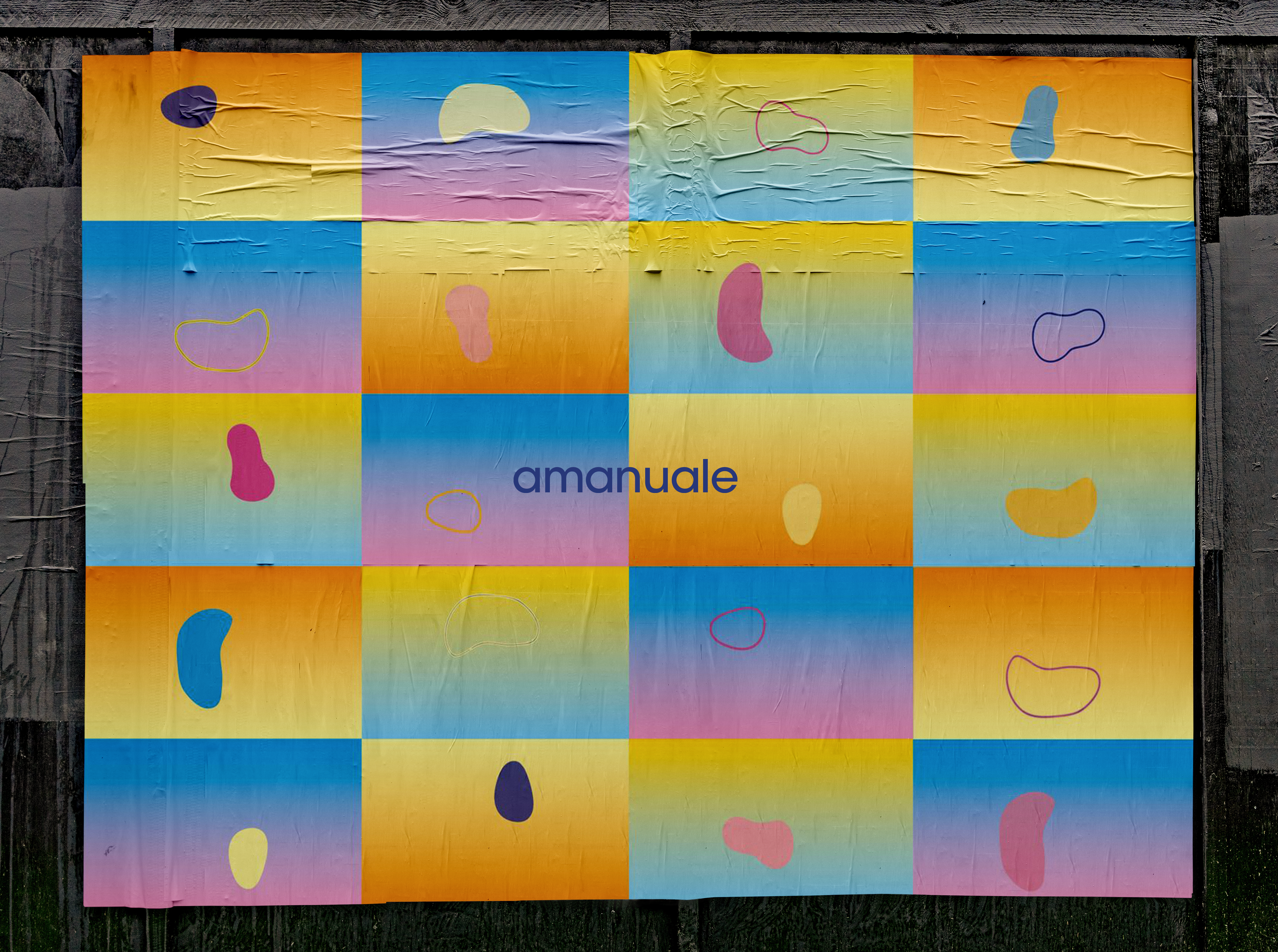
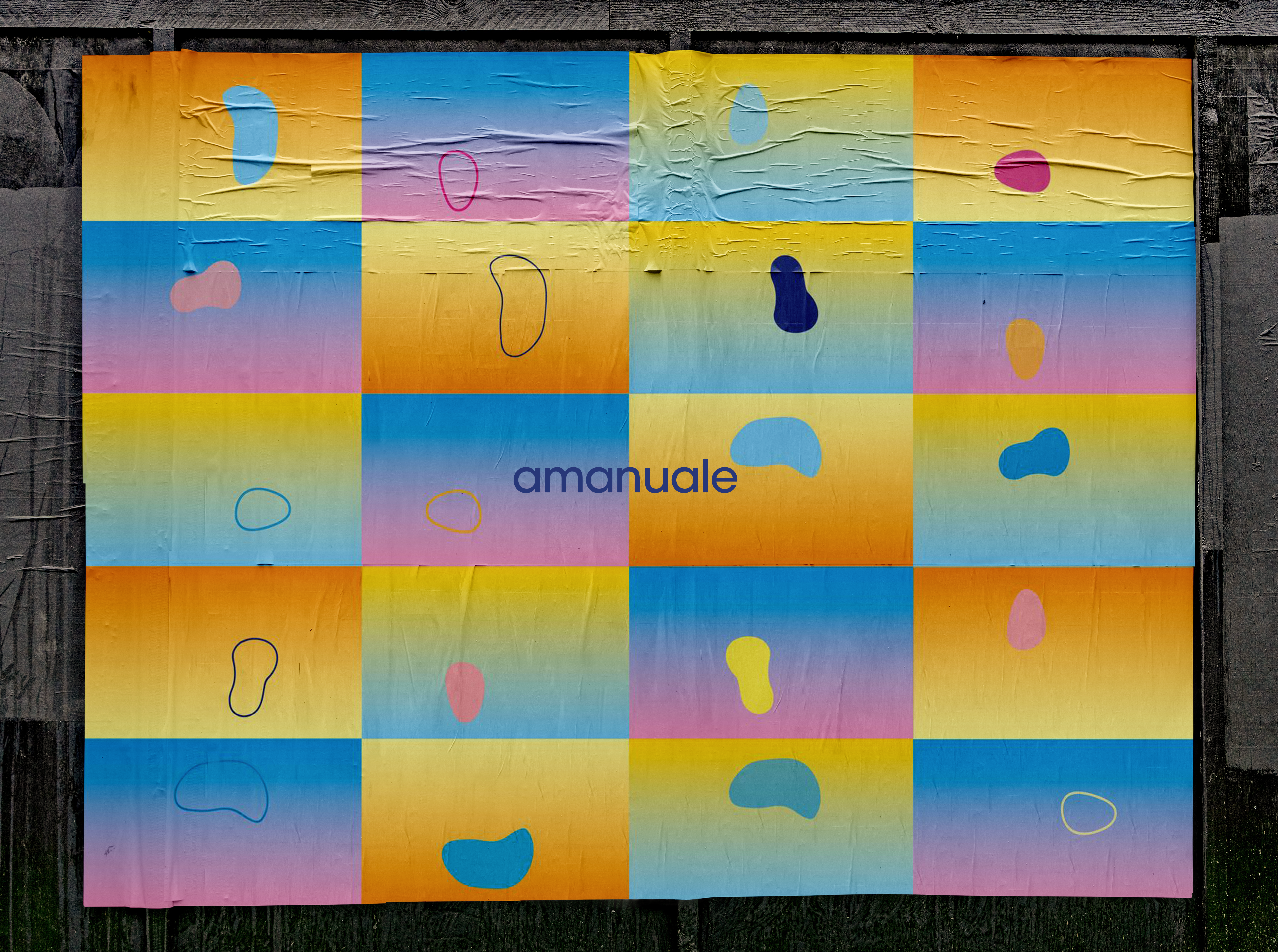
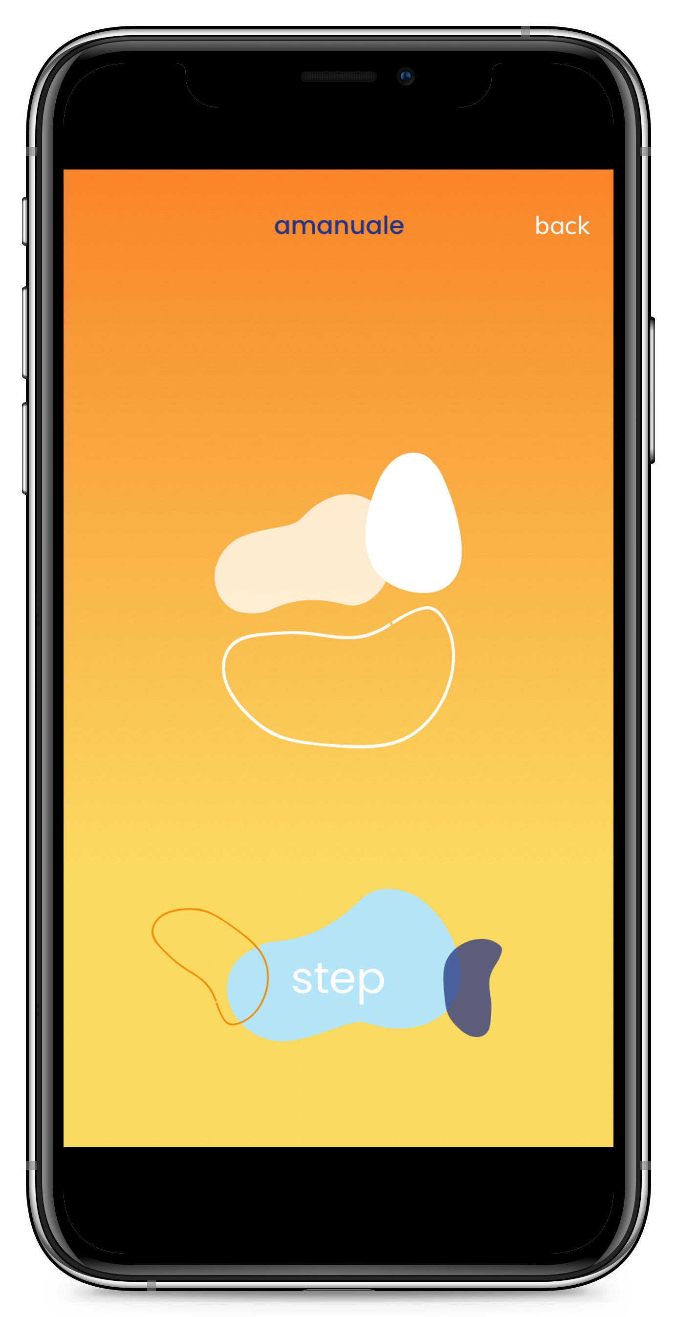
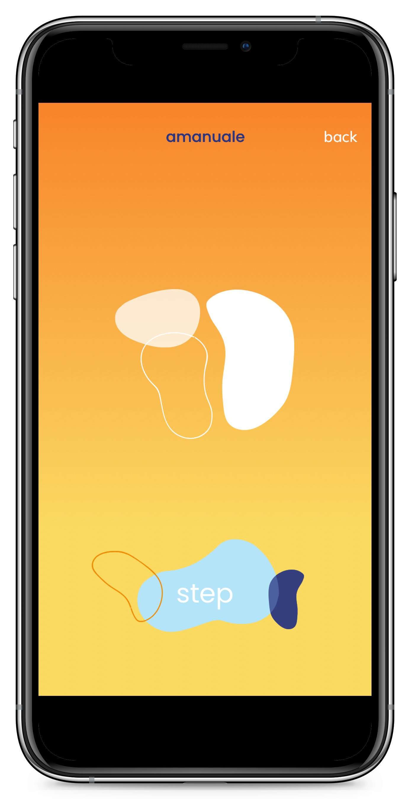
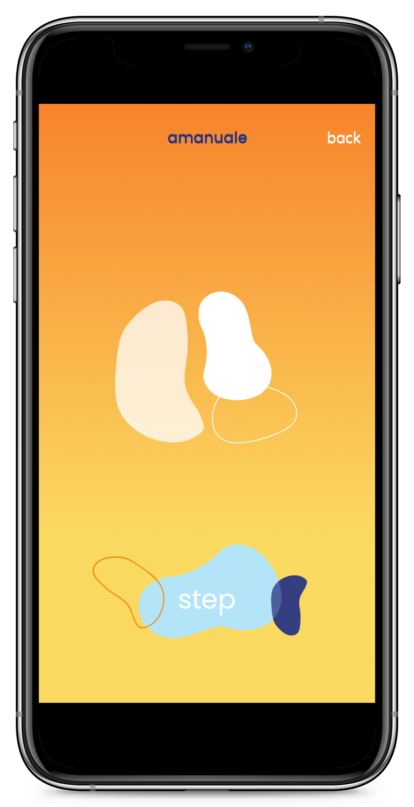
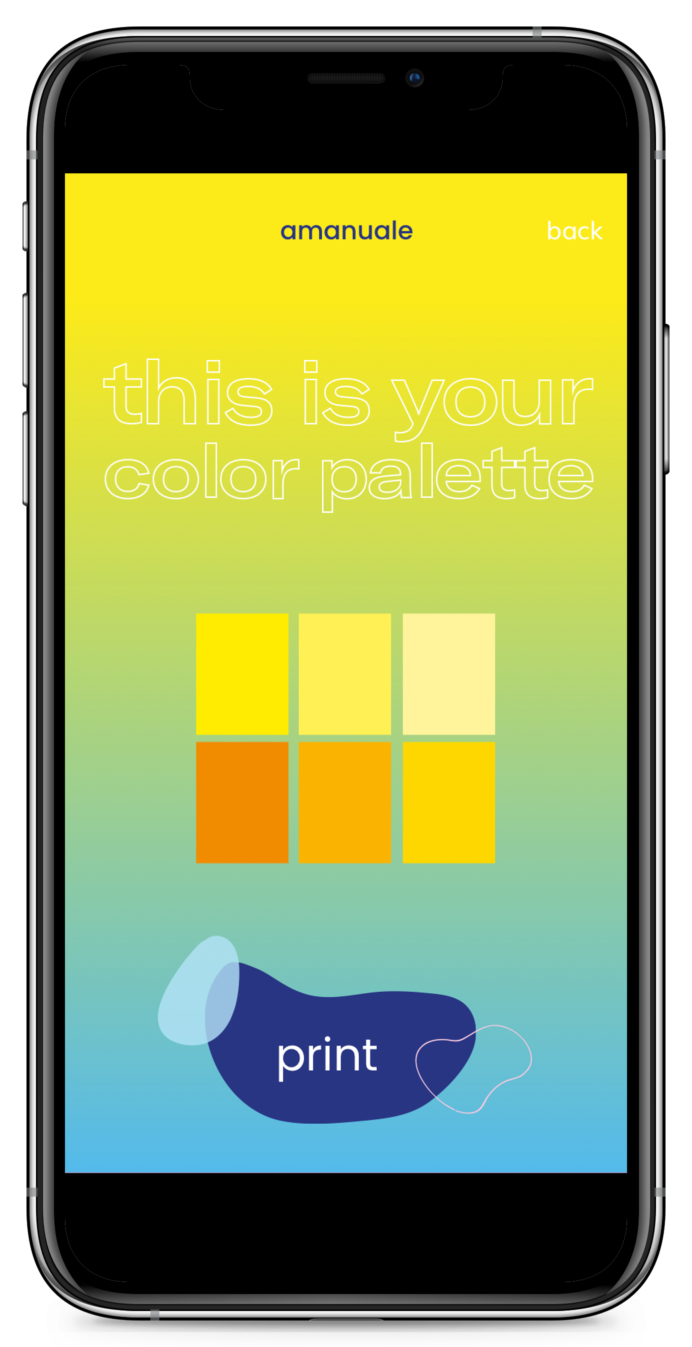
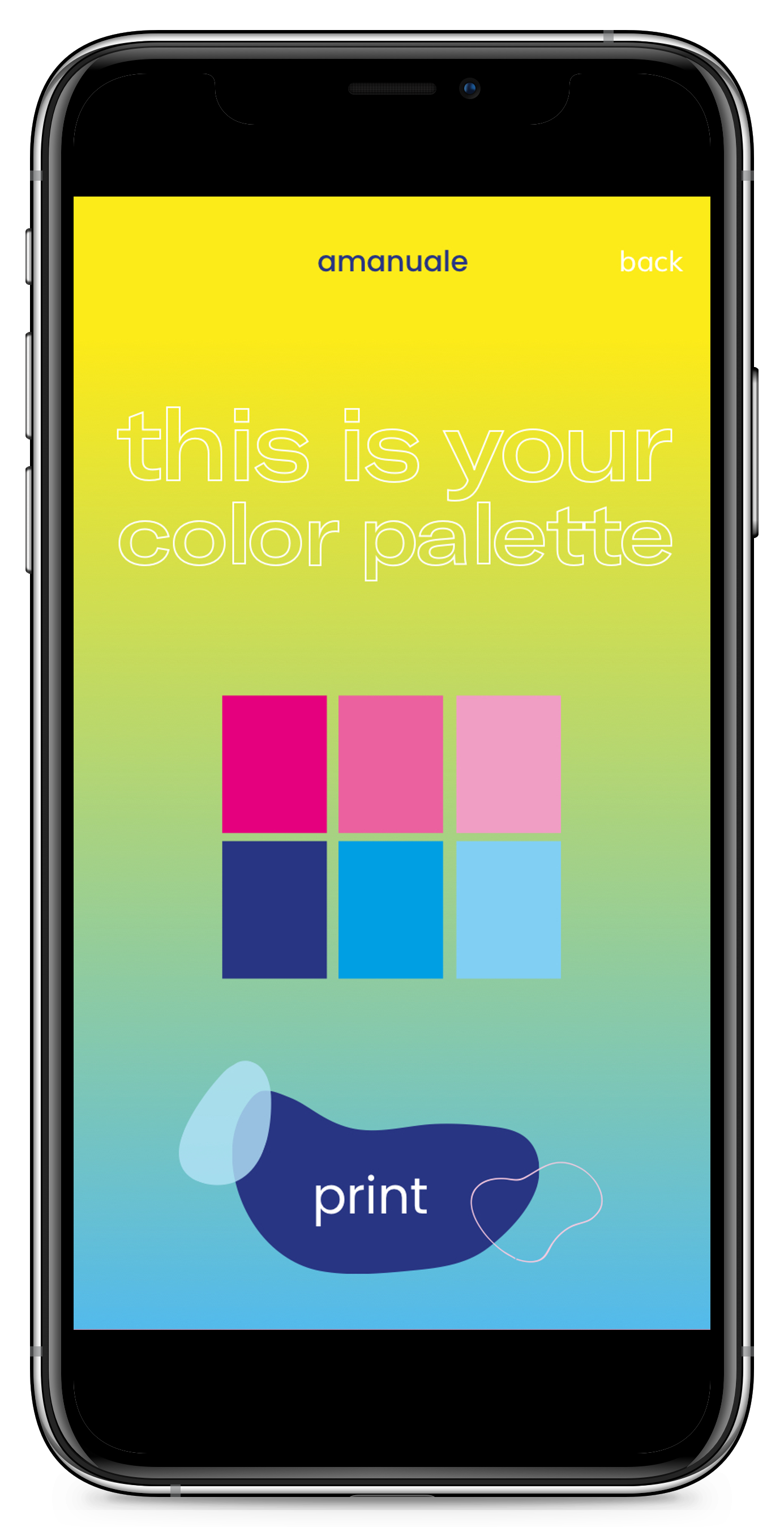
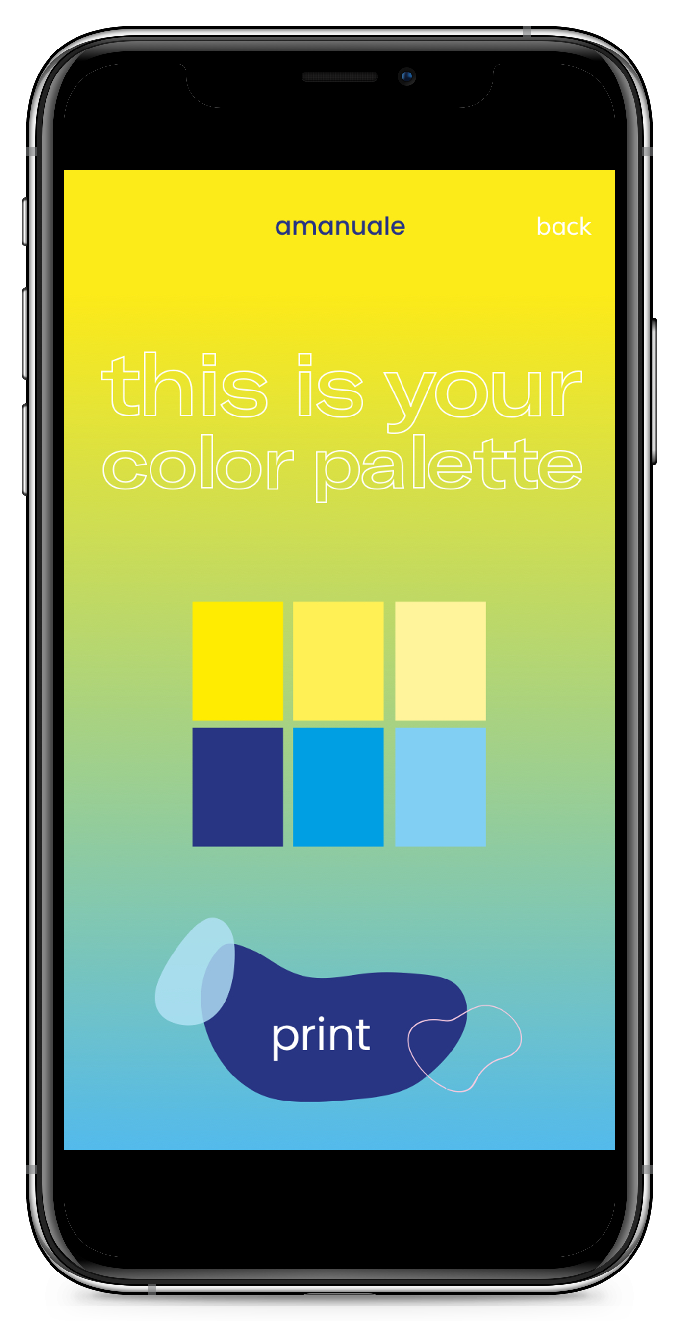
The color palette of Amanuale reflects the essence of a "summer fantasy," with soft blues, yellows, and pinks that vary in intensity based on the mood we wish to create. These colors not only serve as core elements of our identity but also combine to form secondary tones, gradients, and transparencies, which are central to the brand's fluid and adaptable aesthetic. In our graphic process, we aimed for personalization. Instead of a fixed icon or logo, the user plays an active role in creating their own brand identity through their experience in the space and with the product. This approach makes the brand flexible, user-driven, and aligned with the concept store’s interactive nature.



‘GRAPHIC IDENTITY’
We worked with the existing concept of 'La Manual Alpargatera' to craft a fresh visual and verbal expression for the brand—one that delves deeper into its core purpose: offering an exchangeable product that brings both foot comfort and the promise of future adventures. The new brand identity blends two key elements: first, the silhouette of reflex points found on the feet, designed to balance, harmonize, and relax different parts of the body; and second, the hours of summer, which represent time for exploration, reflected in the color palette. Together, these elements form a distinctive and memorable graphic identity.


‘AMANUALE APP’
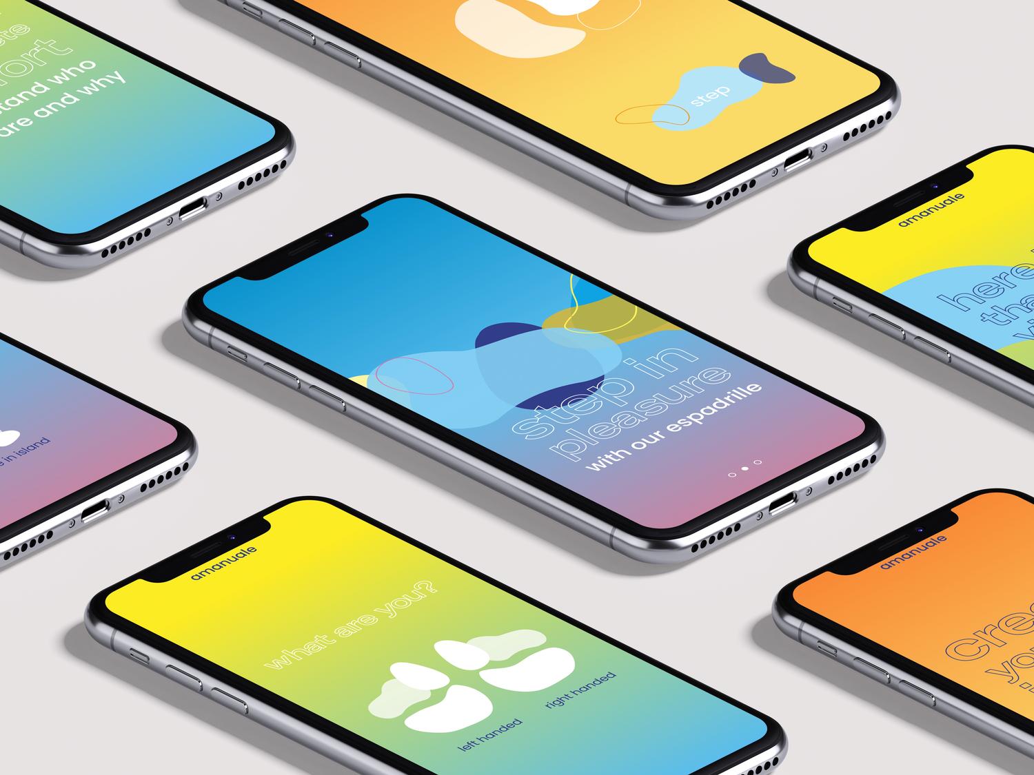
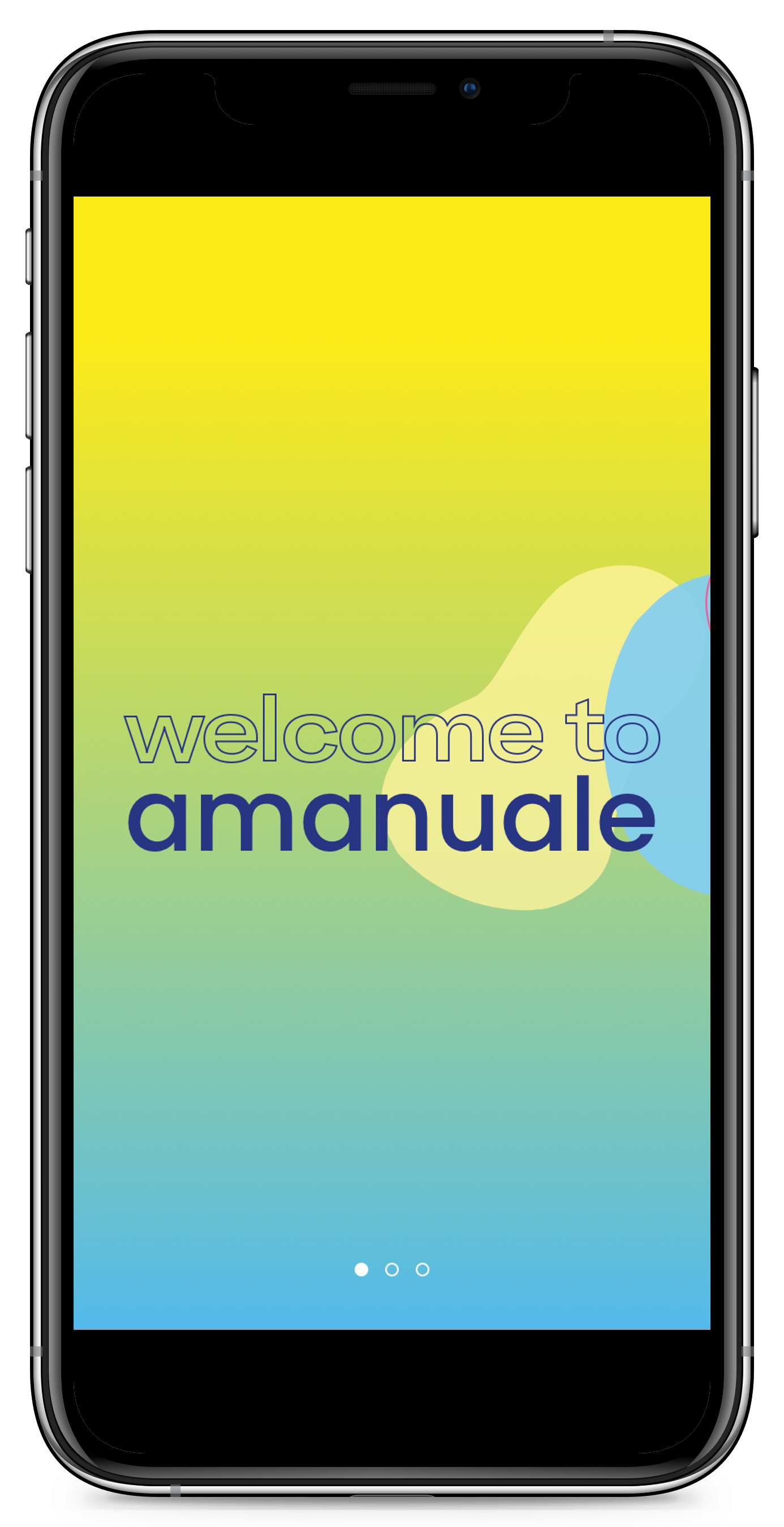
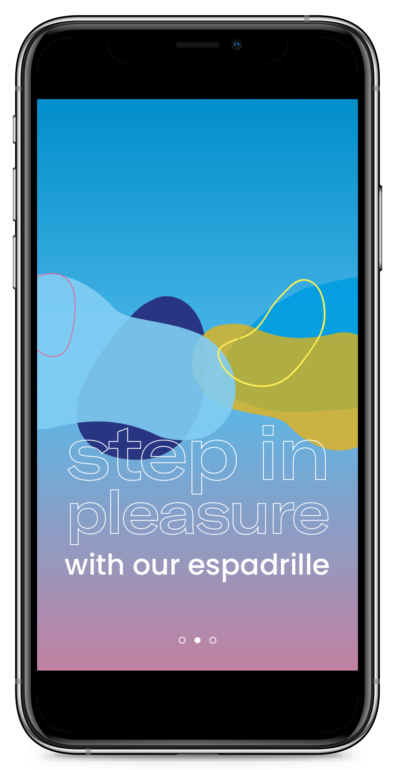
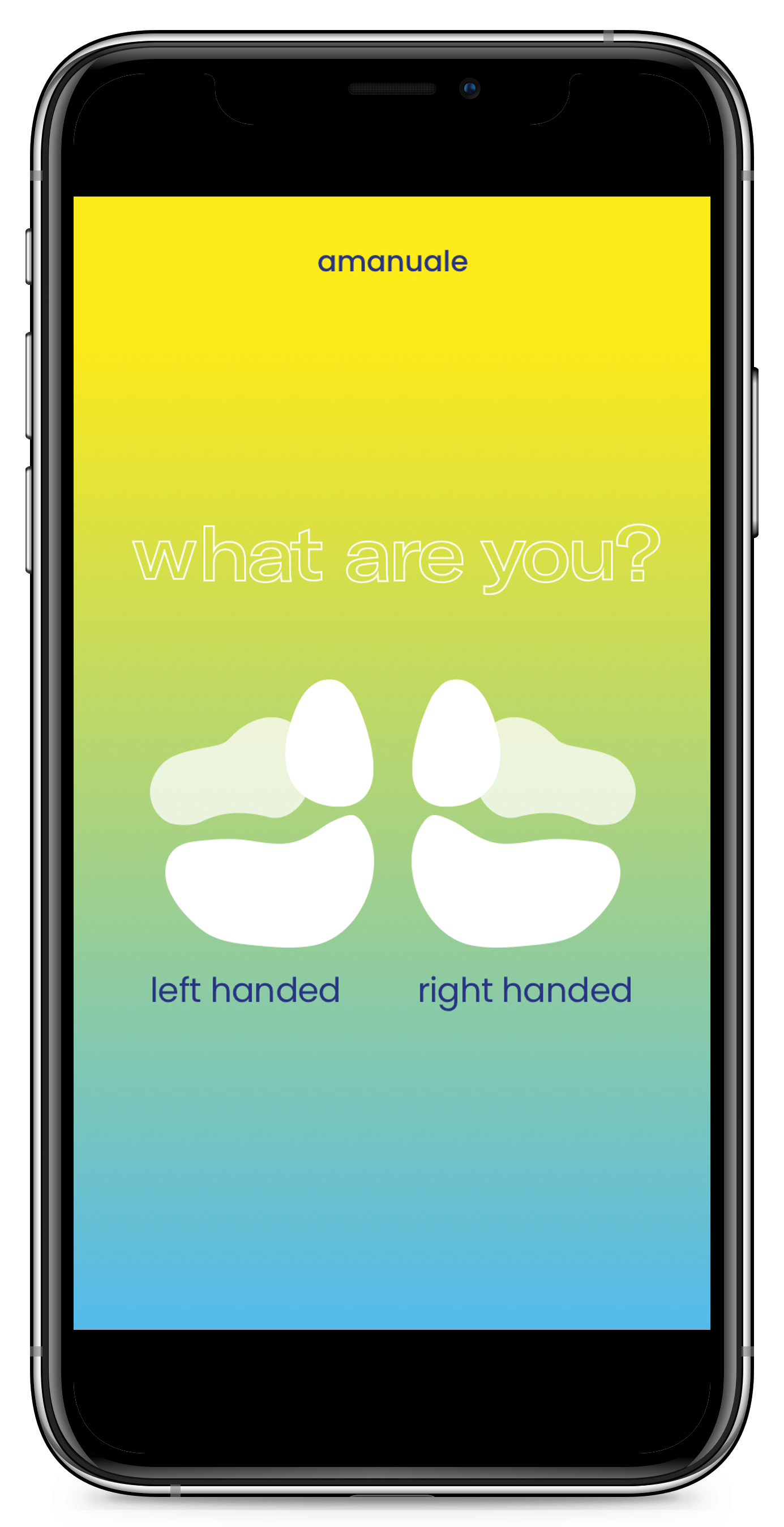
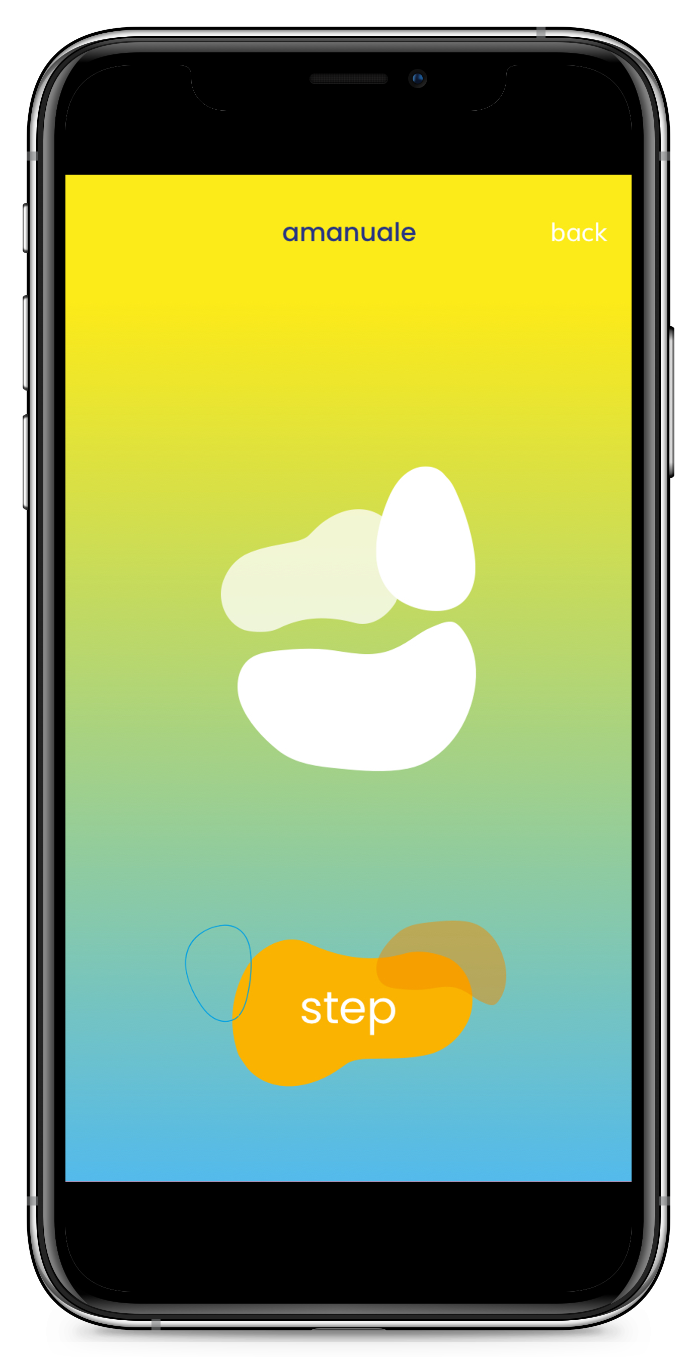
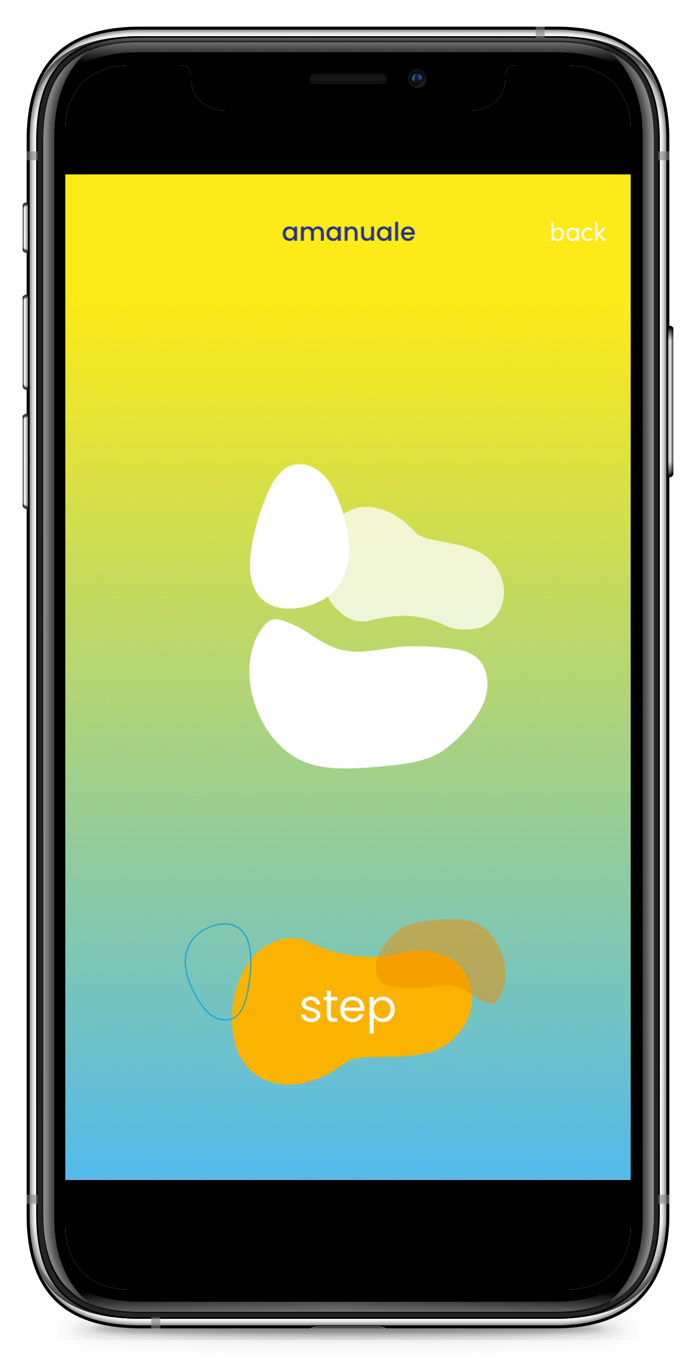
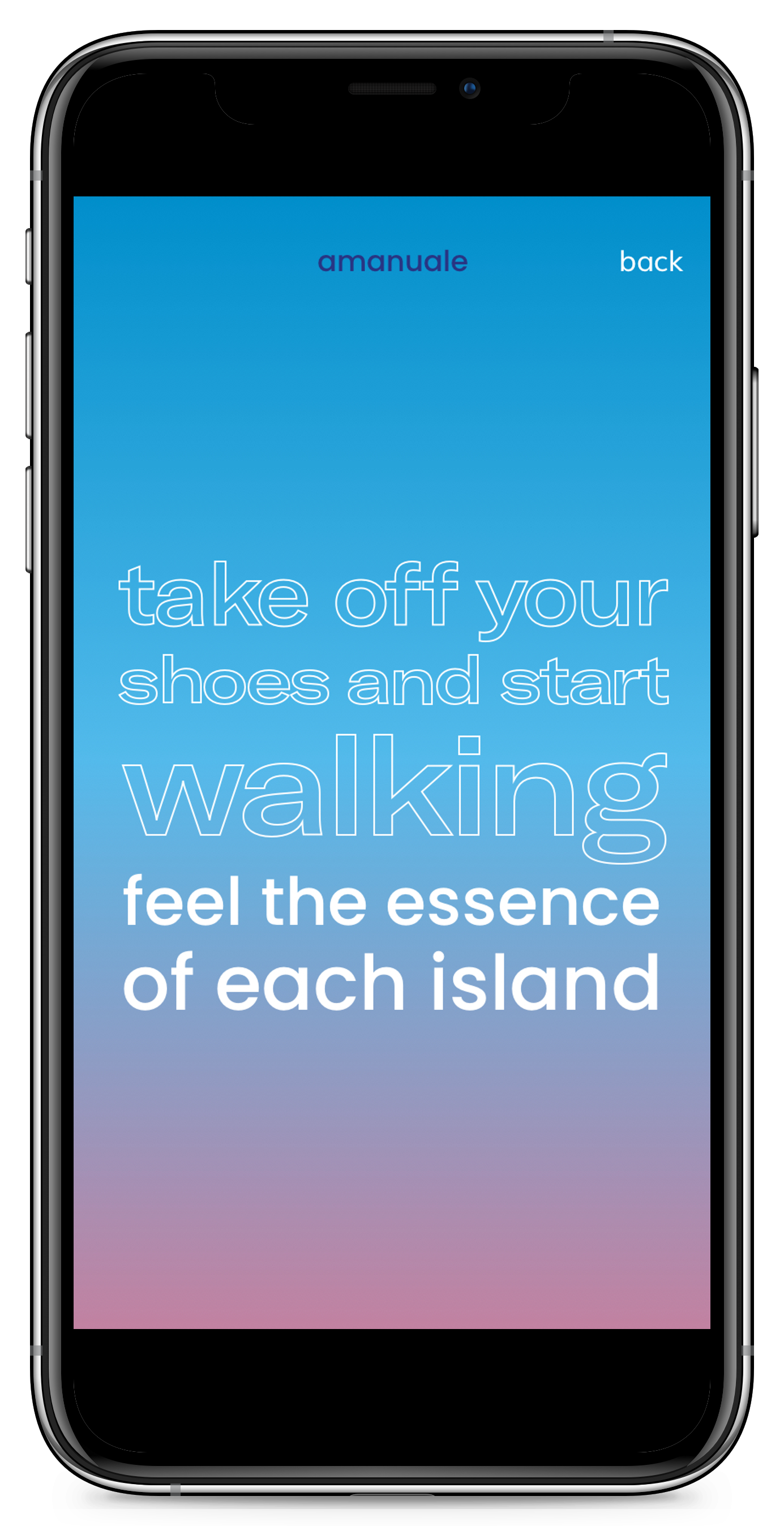
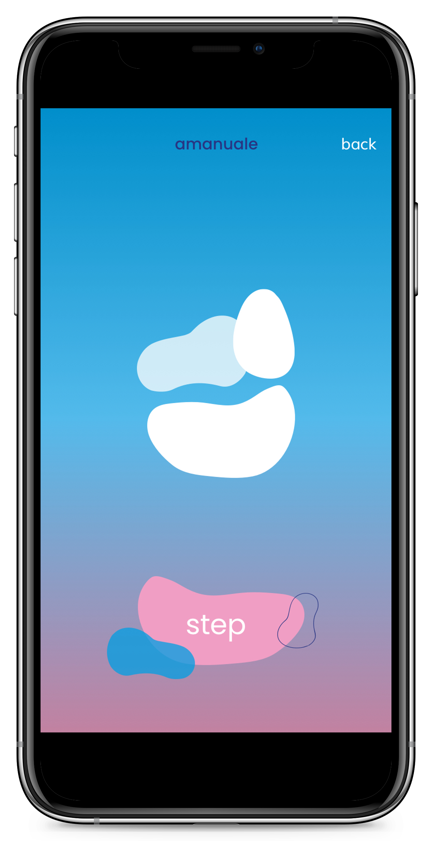
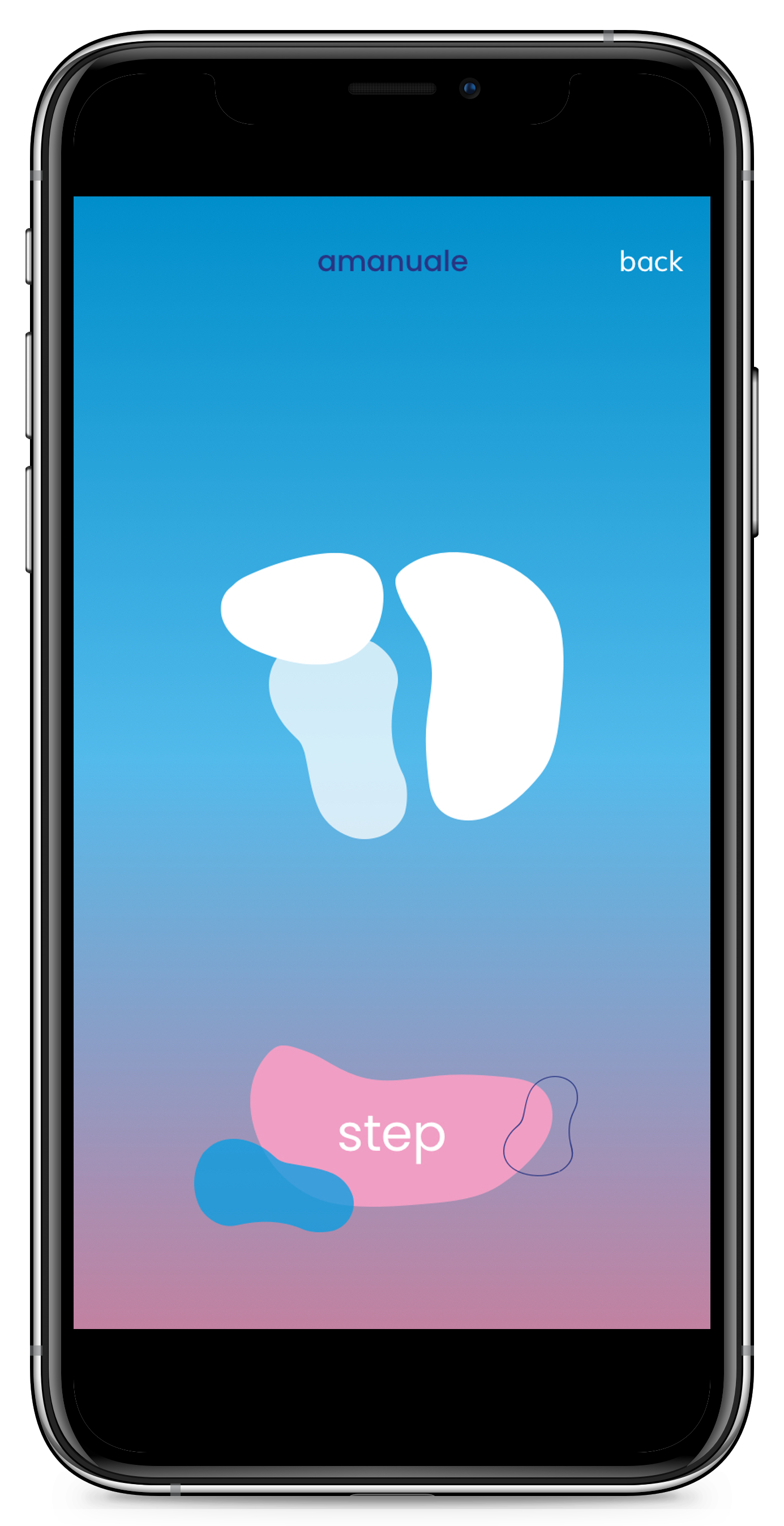
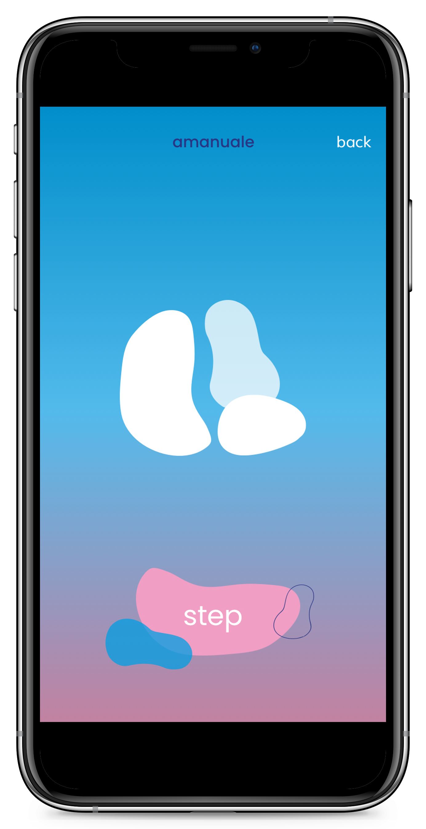
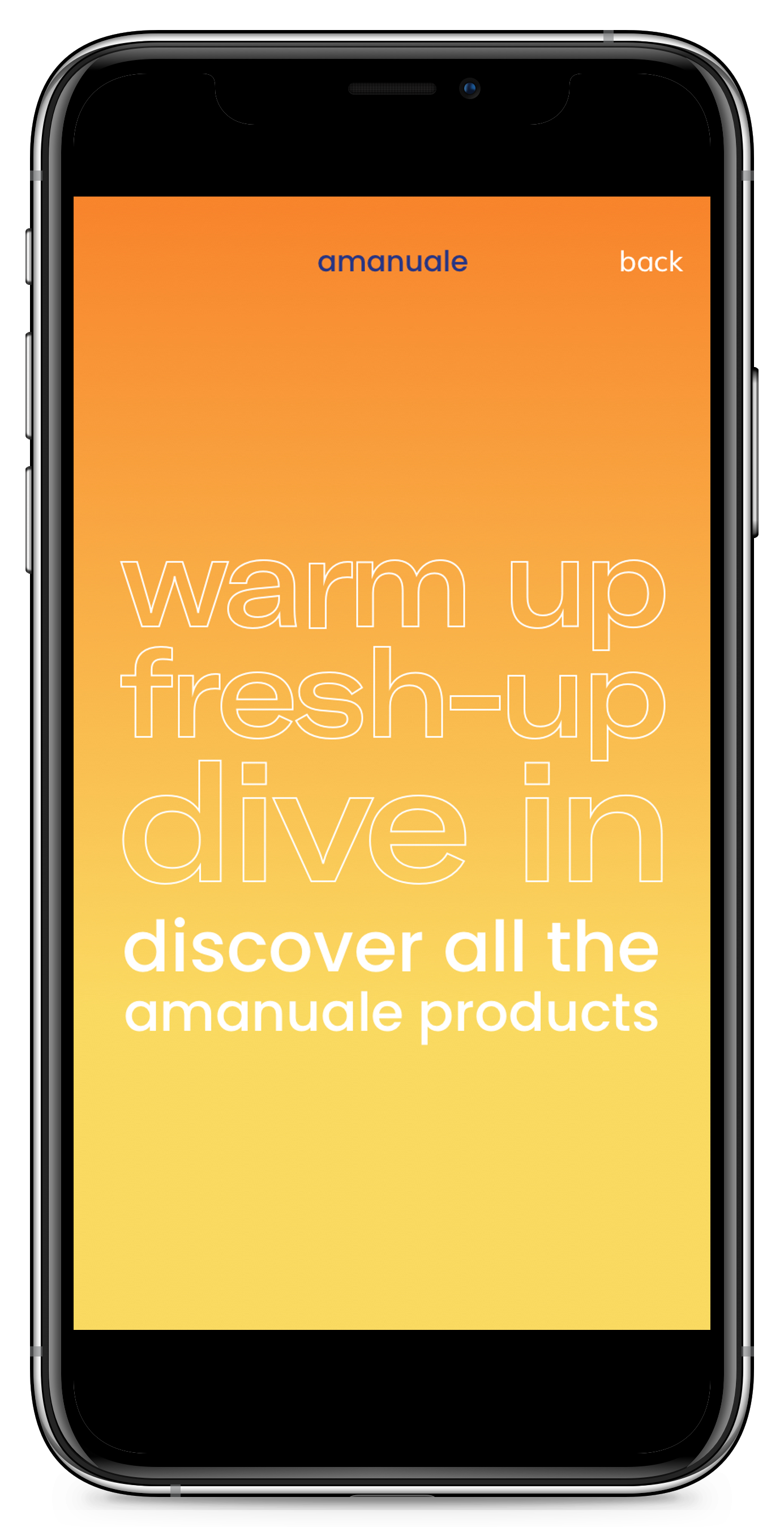
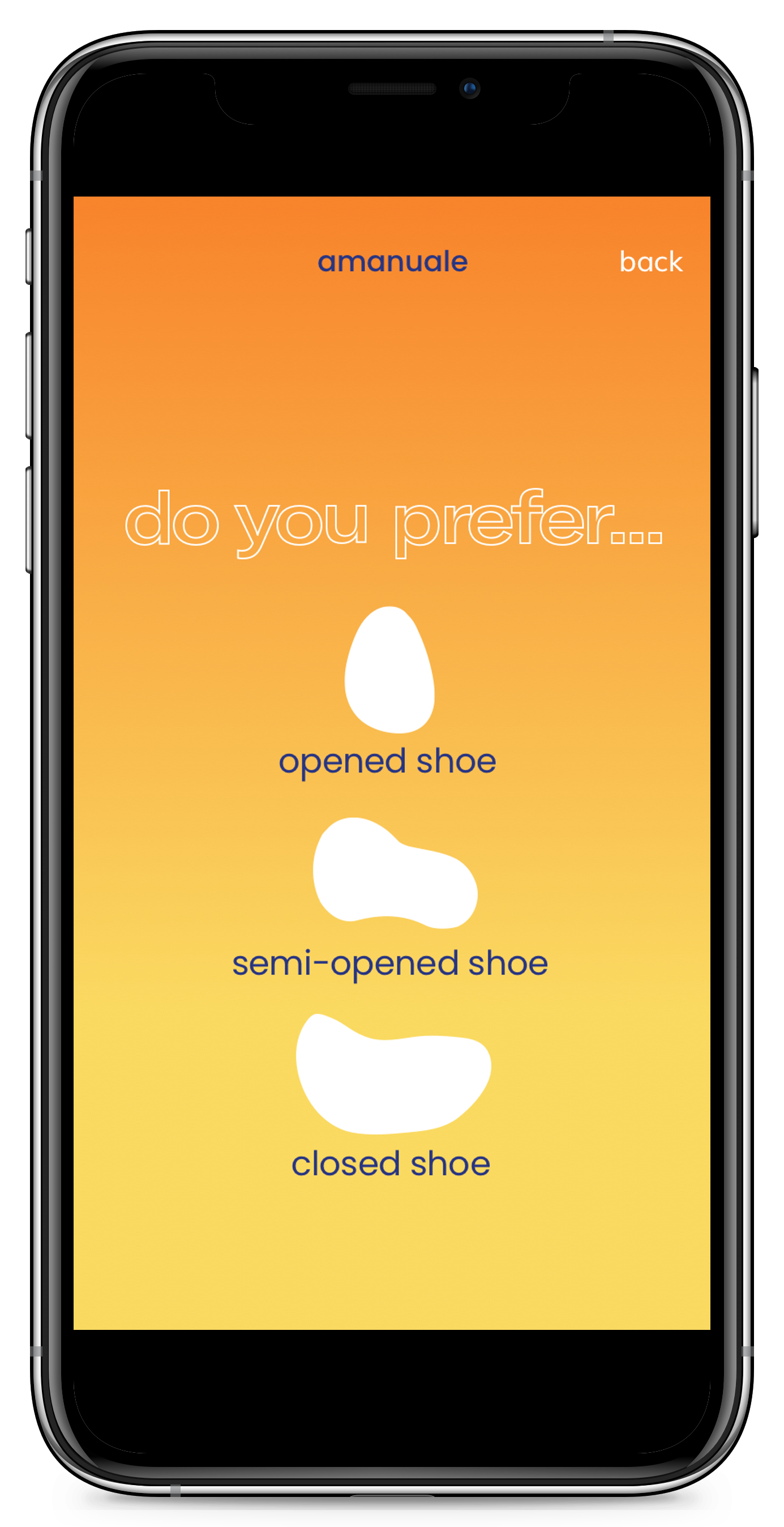
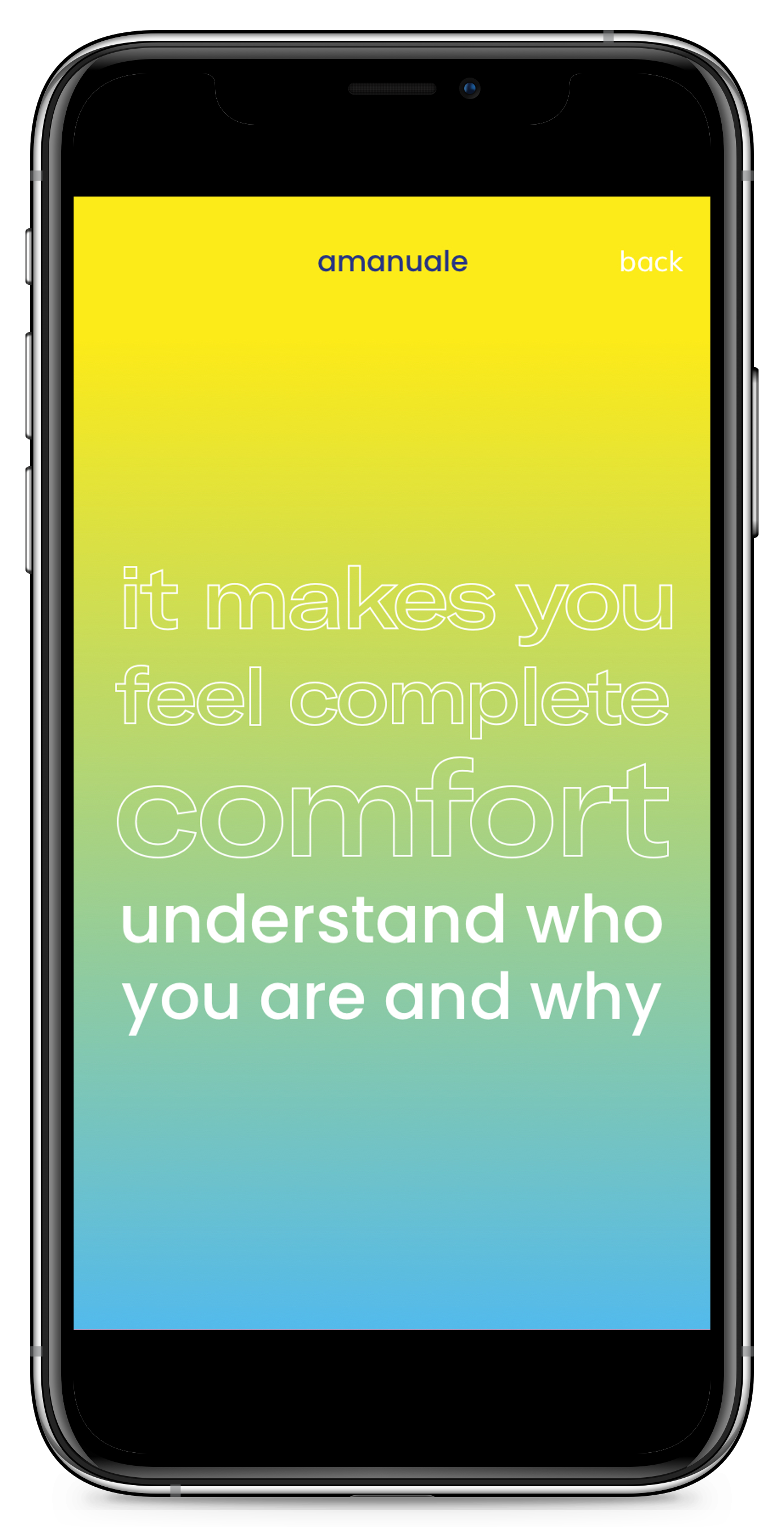
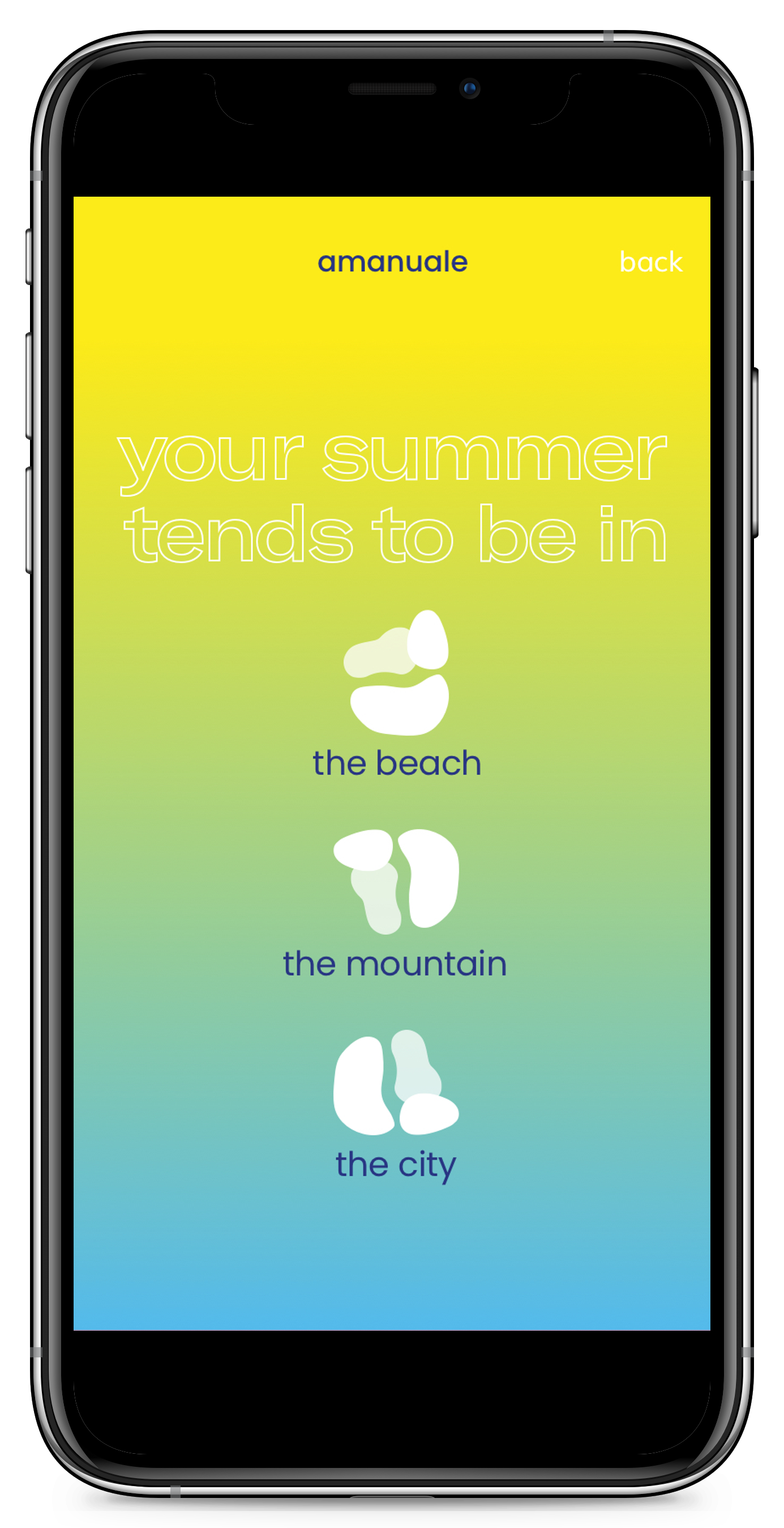
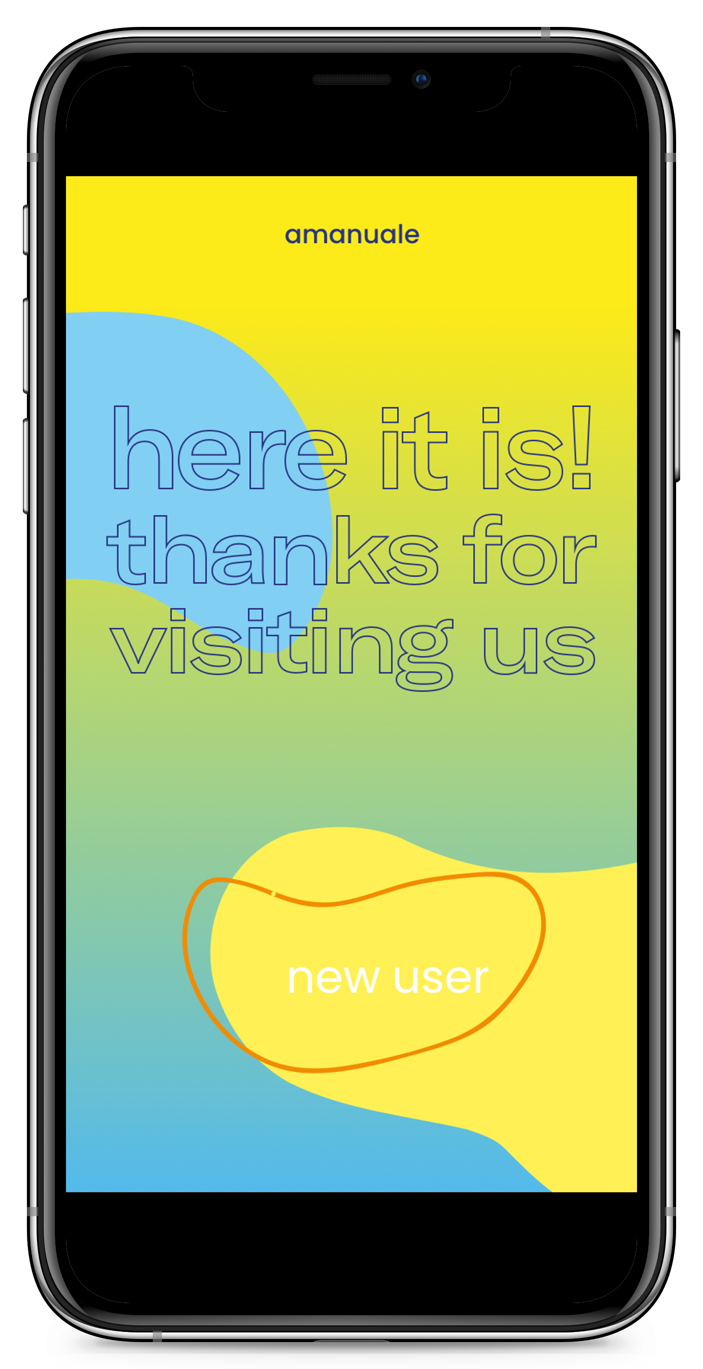
Embodying an urban lifestyle and the unique service offered at Amanuale's shops, consumers can not only design their own shoes but also create a personalized graphic identity. Through the app and its intuitive UI/UX, clients can document their experiences and bring their ideas to life in the form of a physical product. This process embraces sustainability by showcasing how emotional design can evolve into functional, lasting footwear.
Creative & Art Direction:
Marta Torras-Moreno
Marta Torras-Moreno
Services:
Creative Direction / Art Direction / Campaign / Brand Strategy / Brand Identity / Brand Management / Naming / Product Design / UX & UI Design
Creative Direction / Art Direction / Campaign / Brand Strategy / Brand Identity / Brand Management / Naming / Product Design / UX & UI Design
Techniques:
Digital and Set Design / Fashion & Beauty / Photography
Digital and Set Design / Fashion & Beauty / Photography